City/State/Territory Flags
-
![]()
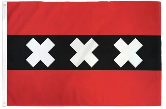
Amsterdam
Adopted: February 5, 1975
Use: City Flag
Ratio: 2:3
Design: Horizontal tricolor (red-black-red) with three white St. Andrew's crosses in the black band.
Symbolism: The colors of the flag are derived primarily from the shield of Amsterdam's coat of arms. While the meaning of the crosses is unknown, historians believe it is derived from the coat of arms of the Persijn family, who owned a large tract of land in the capital.
It is theorized that the crosses represent the three plagues that have hit Amsterdam - namely water, fire, and plague. The three crosses can be found on all kinds of buildings and in many logos.
-
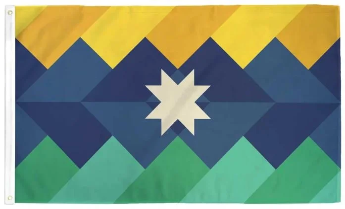
Appalachia
Adopted: March 10, 2023
Use: Unofficial Flag
Designed by: Appalachian Flag Initiative
Design: Three horizontal uneven bands (the top band is yellow, the middle band is blue, and the bottom band is green) at triangular intersections with a white quilt star in the center.
Symbolism: Color Scheme
The green is representative of the lush forests that wrap around the ancient mountains and the rural setting of the region. The navy blue is representative of the blue hue that colors the distant ridgelines that rest on the horizon while traveling through Appalachia. The gold is representative of the morning sun pouring out over the distant hills, indicative of a bright future for those who reside in these hills. The off-white of the quilt star motif is taken from the color of cloth, indicative of a blank canvas from which each Appalachian may draw their own colorful story. Altogether, the design forms a depiction of the beautiful mountain landscape that is distinctly unique to the Appalachian region.
Design Elements
The quilt star is a symbol found throughout Appalachian arts and crafts, commonly seen on the facades of barns and in the construction of quilts in many Appalachian homes. The inclusion of this symbol is meant to symbolize the unique Appalachian people that reside within the mountains, with every rendition of the star being done in the artist’s style and coloration, further including the diverse array of cultures, faces, and backgrounds in the Appalachian people. The horizontal construction of the flag is meant to convey the message of the overlapping scenes of the mountains on the horizon. The jagged peaks, while not common in much of Appalachia, are meant to convey a stronger symbol of mountains and match the quilt star’s geometry. The rolling lines of the rolling hills flag is meant to be closer to the reality of the Appalachian mountains for many people, conveying the actual topography of these weathered ancient mountains that many of us call home. The broken color fragments of the mountain quilt is meant to convey the analogy of a quilt, a common craft that can be found throughout Appalachia.
-
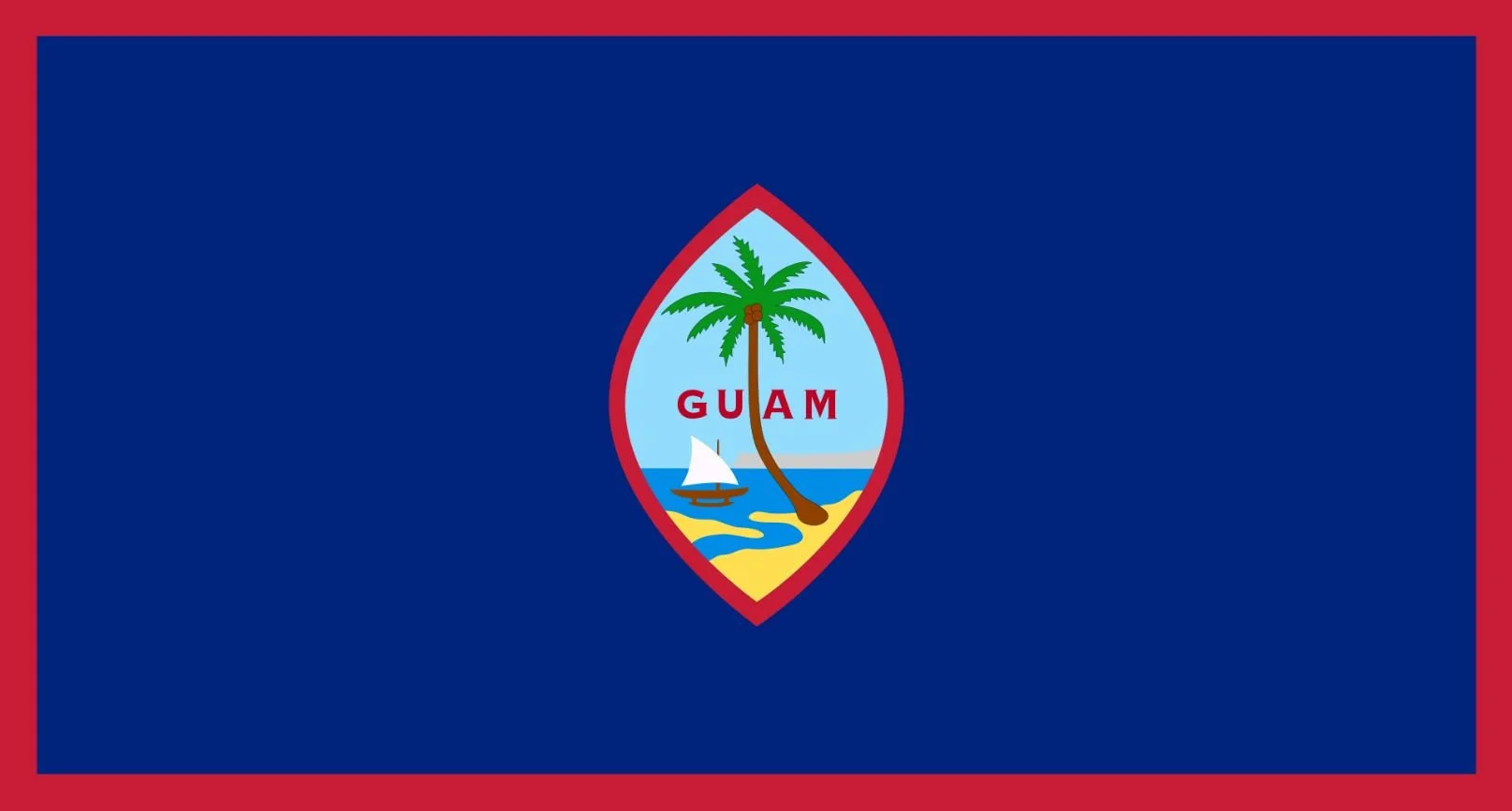
Guam
Adopted: February 9, 1948
Use: Civil and State Flag
Designed By: Gerard Aflague
Design: A dark blue background with a thin red border and the seal in the center.
Symbolism: The territorial flag features a dark blue with a narrow red border on all sides, the red representing the blood spilled during World War II and Spanish sovereignty. The seal in the center of the flag is an almond shaped emblem, which depicts a proa sailing in Hagåtña Bay near Hagåtña, and GUAM colored in red letters.
The shape of the emblem recalls the slingshot stones used by ancient Chamorro people while the landform background depicts the Two Lovers Point cliff on Guam.
As a compliment to the Guam flag design, each of the 19 municipalities designed flags to reflect the unique aspects of Guam's municipal villages.
-
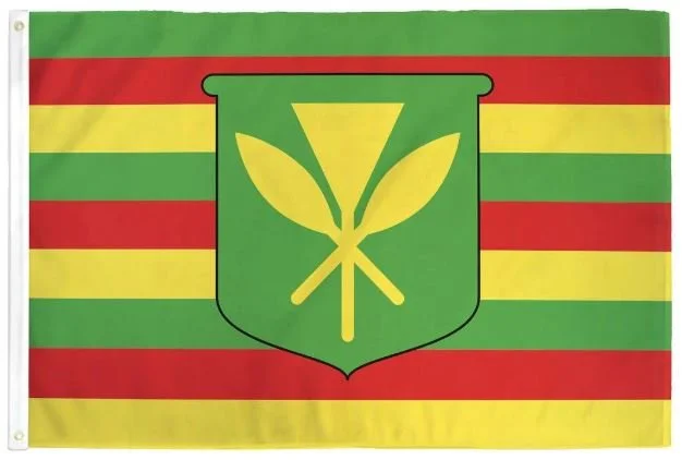
Hawai'i Kanaka Maoli
Introduced: 2001
Use: Alternate design
Designed By: Gene Simeona
Design: Nine alternating stripes of green, red, and yellow defaced with a green shield with a kāhili (ceremonial feather standard) crossed by two paddles.
Symbolism: The origins of the Kanaka Maoli ('true people' in the Hawaiian language) design are disputed.Gene Simeona claims to have unearthed the Kanaka Maoli flag in 1999 when he encountered a descendant of Lord George Paulet who told him about an earlier flag. Simeona claims the flag design was resurrected from an "original" Hawaiian green, red, and yellow striped flag, destroyed by British navy Capt. Lord George Paulet when he seized Hawai'i for 5 months in 1843. It was believed that it was Kamehameha's personal flag long before the modern Hawaiian flag.
Another account claims the Kanaka Maoli flag was created by Louis "Buzzy" Agard in the book He Alo a He Alo - In Hawaiian Voices on Sovereignty in 1993. Pages 108-110 demonstrate and describe a design with the alternating red, yellow, black colors and the shield is in the canton rather than the center. It is believed that somewhere along the line, slight modifications were made and the backstory was added to create an emotional attachment to the flag.
While the symbols in the flag are of ancient origin, the overall design itself is not. The flag, with some basic modifications, has served the purpose that he envisioned, adopted as a symbol of protection to replace the union jack, which the Kanaka Maoli and supporters do indeed rally around and fly with pride.
-
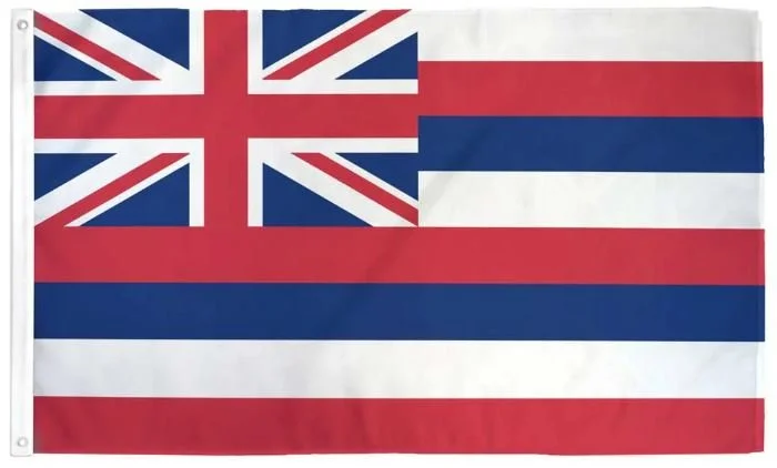
Hawai'i State
Adopted: December 29, 1845
Use: Civil and state flag
Designed By: Unknown; origins tied to Captain Alexander Adams and King Kamehameha I
Design: Eight alternating horizontal stripes of white, red, and blue, with the 4:7 United Kingdom’s Union Flag in the canton.
Symbolism: The canton of the flag of Hawai’i contains the Union Flag of the United Kingdom, prominent over the top quarter closest to the flag mast. The field of the flag is composed of eight horizontal stripes, symbolizing the eight major islands of the Hawaiian archipelago - Hawai’i, Maui, Kaho’olawe, Lāna’i, Moloka’i, O’ahu, Kaua’i, and Ni’ihau. While the colors do not have any official symbolism, there are ties to other Polynesian kingdoms as well as those of foreign powers that visited Hawai'i.
In 1990, Governor of Hawai'i John Waihee proclaimed July 31 to me Lā Hae Hawai'i, the Hawaiian Flag Day, and has been celebrated ever since. It shares a date with Lā Ho'iho'i Ea, Sovereignty Restoration Day, a holiday of the Kingdom of Hawai'i that is celebrated by proponents of the Hawaiian sovereignty movement.
-
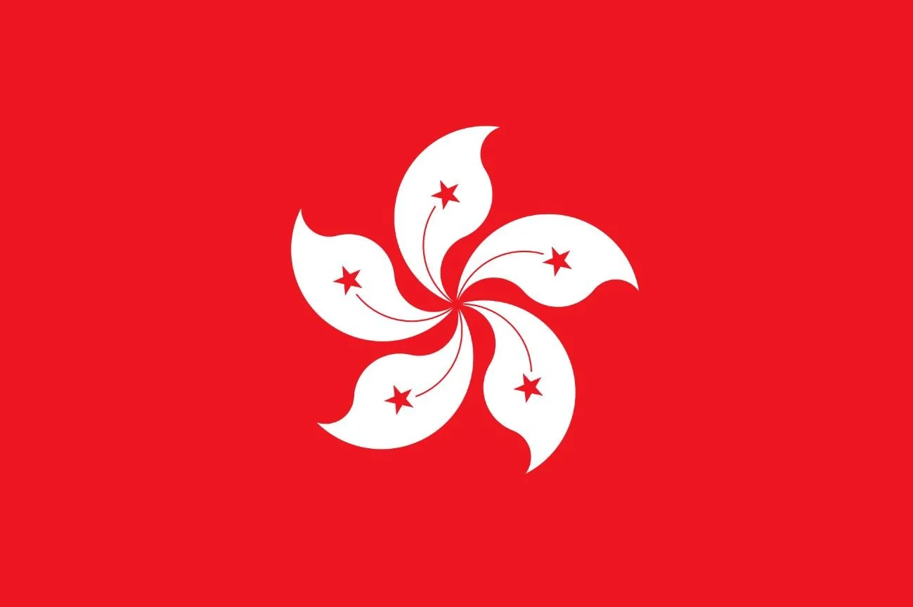
Hong Kong
Adopted: July 1, 1997
Use: Civil and State Flag
Ratio: 2:3
Designed By: National People's Congress
Design: A stylized, white, five-petal Bauhinia blakeana (Hong Kong orchid tree) flower in the center of a red field.
Symbolism: The design comes with cultural, political, and regional meanings. The color (red) is a festive color for the Chinese people, used to convey a sense of celebration and nationalism. The color is also identical to that used in the national People's Republic of China flag, establishing a link between the post-colonial Hong Kong and Mainland China. The position of red and white on the flag symbolize the "one country, two systems" political principle applied to the region. The stylized rendering of the Bauhinia blakeana, a flower discovered in Hong Kong, is meant to serve as a harmonizing symbol for this dichotomy. The five stars of the Chinese national flag are replicated on the petals of the flower.
-
Illinois State
Adopted: September 17, 1969
Use: Civil and State Flag
Designed By: Sharon Tyndale
Design: A state seal above the word Illinois in blue on a white field.
Symbolism: The flag depicts the Great Seal of Illinois, which was originally designed in 1819 and emulated the Great Seal of the United States. In the eagle's beak, there is a banner with the state motto, "State Sovereignty, National Union". Although "State Sovereignty" comes first in the motto, "State" is at the bottom and "Sovereignty" is upside-down. The dates on the seal, 1818 and 1868, represent the year Illinois became a state and the year in which the Great Seal was redesigned by Sharon Tynsdale.
It is one of 10 States to feature an eagle alongside those of Iowa, Michigan, Missouri, New York, North Dakota, Oregon, Pennsylvania, Utah, and Wyoming.
During March 2023, the Illinois state senate approved the Flag Commission, a commission to explore and develop a design for a new state flag. A few months later in May, the Illinois State House approved the same bill. Lawmakers state that the decision on a flag made by the General Assembly could come in the next few years.
-
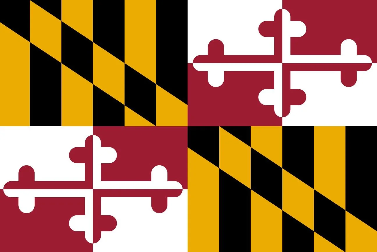
Maryland State
Adopted: March 9, 1904
Use: Civil and State Flag
Design: Heraldic banner of Cecil Calvert, 2nd Baron Baltimore
Symbolism: The Maryland Colony was founded by the 2nd Baron Baltimore, Cecil Calvert, which was granted to him as the son and heir of the 1st Baron Baltimore, George Calvert, by King Charles I. Lord Baltimore’s banner, the yellow and black design, was used by pro-Marylanders during the American Civil War. The “Crossland Banner”, the red and white design, was used by pro-Confederate Marylanders during the American Civil War.
The design incorporates both of the coats of arms used by George Calvert, which began to appear officially after the Civil War. The flag was first flown in Baltimore on October 11, 1880, at a parade marking the 150th anniversary of the founding of Baltimore. It was flown again on October 25, 1888, at Gettysburg Battlefield during ceremonies dedicated to monuments to the Maryland regiments of the Army of the Potomac by reorganized regiments of the former state militia, now the Maryland National Guard.
The flag was not officially adopted as the state flag until 1904. The present flag is symbolic of the reunion of all the citizens in the state and is represented through the colors of the flag.
-
Massachusetts State Redesign
Use: Proposed State Flag
Designed By: Flag for Good
Design: A green pine tree on a white field with a blue vertical stripe along the fly side with six white stars.
Symbolism: This design draws from the historic flag of New England (similar to the Bunker Hill historical flag). The white base is a nod to the current MA flag and the six stars represent Massachusetts as the sixth state to join the union.
-
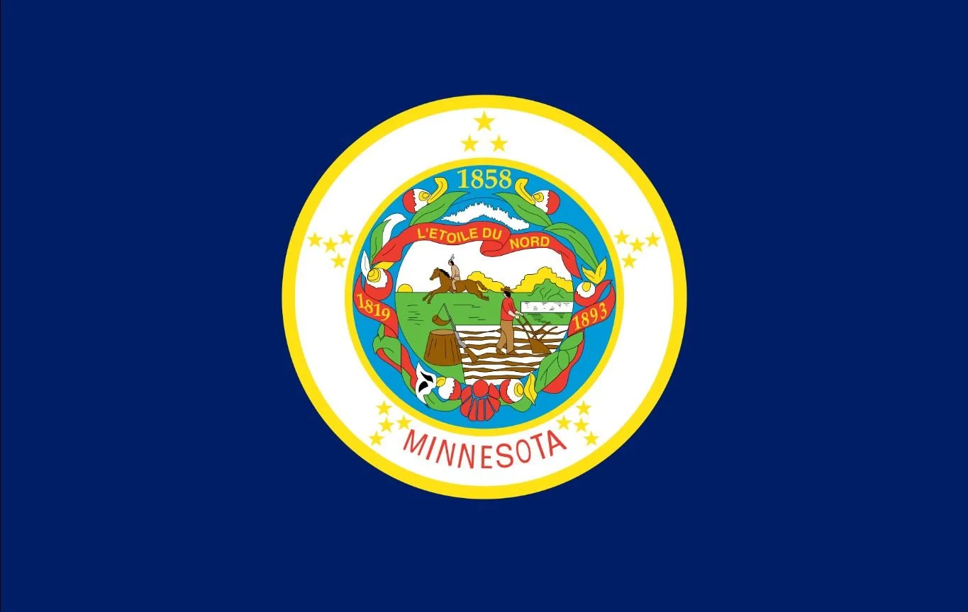
Minnesota State
Adopted: August 2, 1983
Use: Civil and State Flag
Designed By: Amelia Hyde Center
Design: A state seal on a medium blue field.
Symbolism: The flag is rectangular and features a design emblazoned in the center of a field of medium blue. The central design features three concentric circular fields. The innermost field is filled with a simplified version of the state seal. Around the seal is a ring of blue ornamented with a wreath of pink-and-white lady's-slipper and a red ribbon upon which are written the years 1819 and 1893. At the top of the blue ring the year 1859 is set in gold. Around the blue ring is a white ring upon which 19 stars form five radially arrayed groups. Each group contains four stars except for the top-center group, which has two stars of the standard size and one star larger than the rest. Between the bottom two groups the name of the state is set in red. Both the blue ring and the white ring are bordered with gold.
The seal contains a Native American riding horseback in the background, symbolizing Minnesota's Native American heritage. There is a sunset on the western horizon, with the Native American riding towards the south. The straight horizon line reflects the plains covering much of Minnesota. The native's horse and spear and the pioneer's ax, rifle, and plow represent the tools of daily life. The only interaction between the two figures is observing one another.
The Mississippi River and St. Anthony's Falls are depicted in the revised seal to note the importance of these resources in transportation, industry, and settling of the state. Beyond the falls on the current seal are three pine trees representing the state tree and the three pine regions of the state - the St. Croix, Mississippi, and Lake Superior.
-
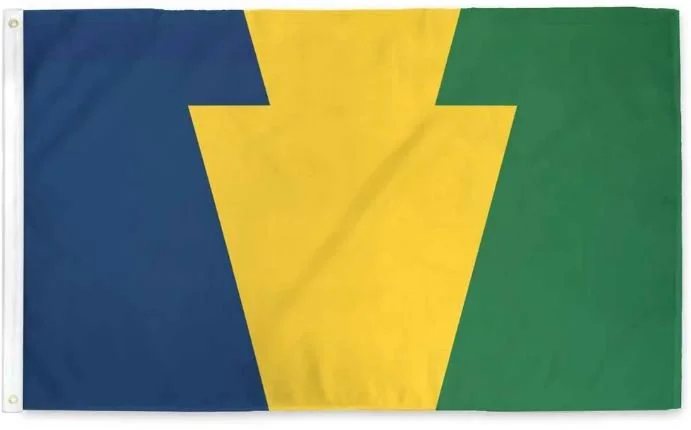
Pennsylvania Keystone
Adopted: March 10, 2017
Use: Proposed Redesign
Designed By: Tara Stark
Design: Bicolor divided midway along the breadth, green at the fly, and blue at the hoist; charged with gold Keystone spanning the entire breadth of the flag.
Symbolism: A keystone typing opposite sides of the flag together, as Pennsylvania was at the center tying together the original 13 colonies of the United States and continues to be at the center of national thought.
The colors have multiple meanings. The Green, gold, and blue for Virtue, Liberty, and Independence (the state motto). When displayed vertically by the hoist with the blue at the top, recalls the shield in the state Coat of Arms, and all the symbolism therein:
Green for fertile fields and Pennsylvania’s wealth of human thought and action
Gold for Pennsylvania's rich natural resources
Blue for state commerce being carried worldwide
-
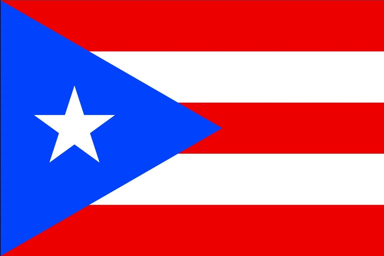
Puerto Rico
Adopted: July 24, 1952
Use: State Flag
Ratio: 2:3
Designed By: Francisco Gonzalo Francisco Gonzalo Marín
Design: Five equal horizontal bands of red (top and bottom) alternating with white; blue equilateral triangle based on the hoist side bears a large, white, five-pointed star in the center.
Symbolism: The three red stripes represent the blood from the brave warriors. The two white stripes represent the victory and peace that they would have after gaining independence. The white star represents the island of Puerto Rico. The blue represents the sky and blue coastal waters. The triangle represents the three branches of government.
-
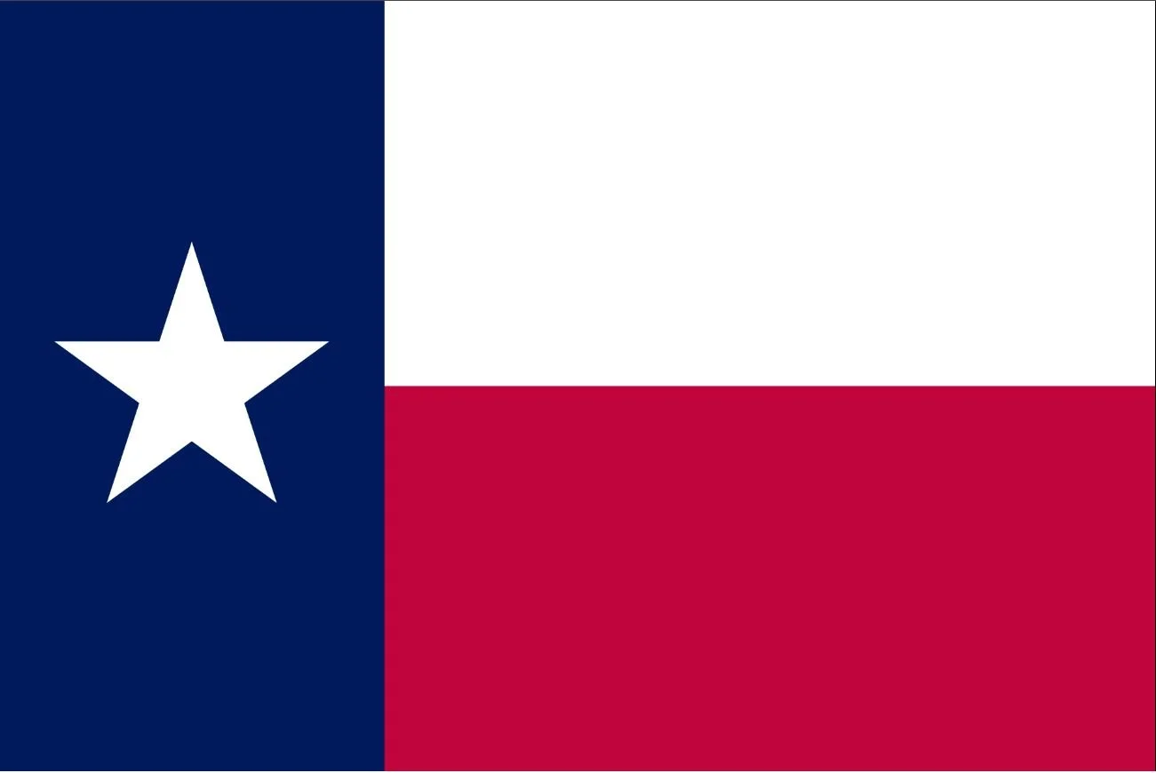
Texas State
Adopted: January 25, 1839 (Republic of Texas)
Readopted: August 31, 1933
Use: Civil and State flag
Designed By: Unknown
Design: One third of the hoist is blue containing a single centered white star. The remaining field is divided horizontally into a white and red bar.
History: The flag was adopted as the national flag of the Republic of Texas on January 25, 1839 and when Texas later became the 28th state, the national flag became the state flag on December 29, 1845. From 1879 until 1933, there was no official state flag, although the Lone Star Flag remained the de facto state flag.
In adopting the Revised Civil Statutes of 1879, the Legislature repealed all statutes not expressly continued in force; since the statutes pertaining to the flag were not among those renewed, Texas was formally flagless until the passage of the 1933 flag law.
The actual designer of the Lone Star flag is unknown. Some claim that Charles B. Stewart of Montgomery, Texas, is either the designer of the flag or drew the image used by the Third Congress when enacting the legislation adopting the flag. However, Stewart's drawing "looks suspiciously like a tracing of a Peter Krag art, including the upside down signature of President Lamar.
Symbolism: The Texas Flag Code assigns the following symbolism to the colors of the Texas flag: blue stands for loyalty, white stands for purity, and red stands for bravery. The single (lone) star represents ALL of Texas stands for our unity as one for God, State, and Country.
The idea of the single red and single white stripe dates back to the short-lived Republic of Fredonia,a small state near modern Nacogdoches, which seceded from Mexico in 1826 before being forcibly re-integrated. The new state was formed through an alliance between local Anglo settlers and Native American tribes and the Fredonian flag used a white and red stripe to symbolize the two ethnic/racial groups from which the state was formed. Though this rebellion ultimately failed it served as an inspiration to the later Texas Revolution.
The idea of the "lone star" is an older symbol predating the flag, which was used to symbolize Texans' solidarity in declaring independence from Mexico. The "Lone Star" is still seen today as a symbol of Texas' independent spirit, and gave rise to the state's official nickname "The Lone Star State".
-
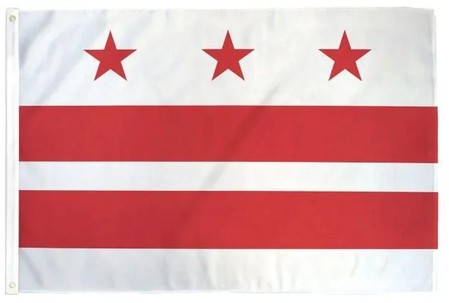
Washington, D.C.
Adopted: October 15, 1939
Use: Civil and state flag
Ratio: 1:2
Designed By: Charles A.R. Dunn
Design: Three red stars above two red bars on a white field.
Symbolism: It is an armorial banner based on the design of the coat of arms granted to George Washington's great-great-great-grandfather, Lawrence Washington of Sulgrave Manor, Northamptonshire, England, in 1592. The coat of arms was used privately by the president in his home at Mount Vernon. In heraldry, the stars are called mullets and the coat of arms is blazoned as argent two bars gules, in chief three mullets of the second.
In 1938, the flag was selected by a commission created by Act of Congress with the help of the Commission of Fine Arts. The District Flag commission was composed of three non-elected federally-appointed members: the president of the Board of Commissioners, the secretary of war and the secretary of the Navy. It was seen at the time as a symbol of the lack of representation of Washingtonians as no local group was involved in the selection process. Paradoxically, it went from being rejected by many in the local population to being embraced by most DC residents, the DC Statehood Movement, and businesses as a symbol of local identity in the 21st century.
-
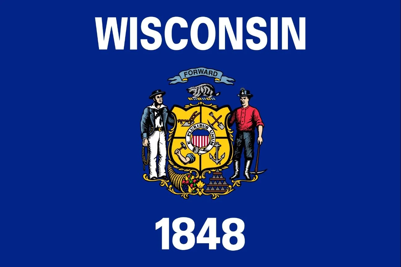
Wisconsin State
Adopted: October 15, 1939
Use: Civil and state flag
Ratio: 1:2
Designed By: Charles A.R. Dunn
Design: Three red stars above two red bars on a white field.
Symbolism: It is an armorial banner based on the design of the coat of arms granted to George Washington's great-great-great-grandfather, Lawrence Washington of Sulgrave Manor, Northamptonshire, England, in 1592. The coat of arms was used privately by the president in his home at Mount Vernon. In heraldry, the stars are called mullets and the coat of arms is blazoned as argent two bars gules, in chief three mullets of the second.
In 1938, the flag was selected by a commission created by Act of Congress with the help of the Commission of Fine Arts. The District Flag commission was composed of three non-elected federally-appointed members: the president of the Board of Commissioners, the secretary of war and the secretary of the Navy. It was seen at the time as a symbol of the lack of representation of Washingtonians as no local group was involved in the selection process. Paradoxically, it went from being rejected by many in the local population to being embraced by most DC residents, the DC Statehood Movement, and businesses as a symbol of local identity in the 21st century.
Country Flags - Americas & Poles
-
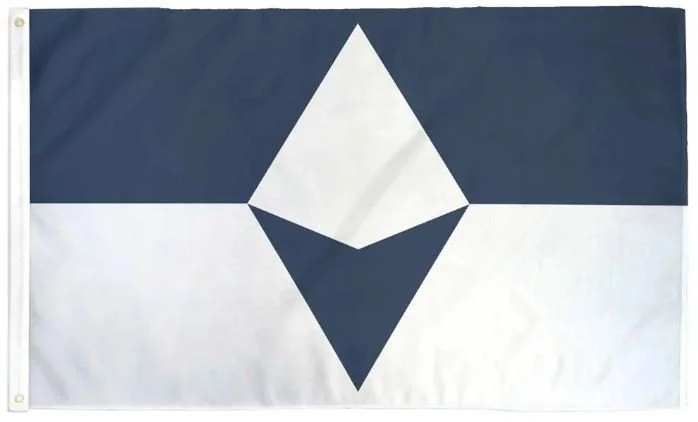
Antartica - True South Proposal
Created: 2018
Use: Unofficial
Designed By: Evan Townsend
Design: A horizontal bicolor of equally sized navy blue and white bands with a white pyramid centered in the blue band and opposing navy blue arrow pointing down centered in the white band.
Symbolism: The horizontal stripes of navy and white represent the long days and nights on Antarctica’s extreme latitude. In the center, a lone white peak erupts from a field of ice, echoing those of the bergs, mountains, and pressure ridges that define the Antarctic horizon. The long shadow cast from the unmistakable shape of a compass arrow pointed south, an homage to the continent’s legacy of exploration. Together, the two center shapes create a diamond, symbolizing the hope that Antarctica will continue to be a center of peace, discovery, and cooperation for generations to come.
The flag is named after geographic south, or “true south”, which differs from magnetic south.
The flag quickly gained popularity and has been adopted by a few National Antarctic Programs, Antarctic nonprofits, and expedition teams; flown at several research stations across Antarctica.
-
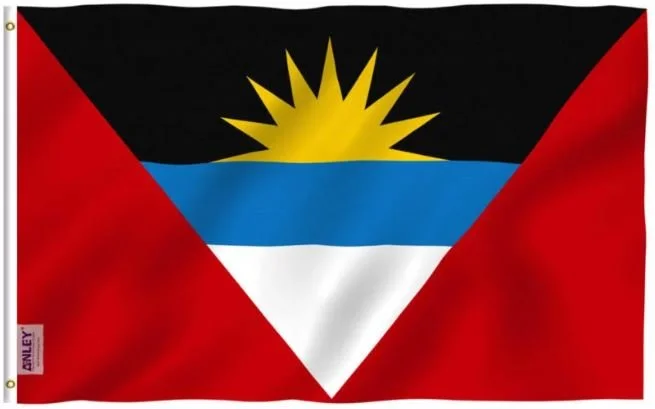
Antigua & Barbuda
Adopted: February 27, 1967
Use: National Flag
Ratio: 2:3
Designed By: Sir Reginald Samuel
Design: A horizontal tri-color of black, blue (half width), and white, with two red right scalene triangles on opposite sides. On the black band is a yellow half-sun with nine rays.
Symbolism: The colors have different meanings: black is for the African ancestry of the people; blue for hope; and red for energy or life of the people. The successive coloring of black, yellow, blue, and white (from the sun down) also stands for the soil, sun, sea, and sand. The blue also represents the Caribbean Sea, and the V-shape is the symbol of victory. The seven points on the flag represent each of the six parishes and the island of Barbuda.
-
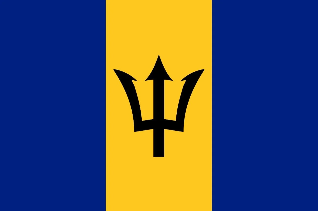
Barbados
Adopted: November 30, 1966
Use: National Flag
Ratio: 2:3
Designed By: Grantley W. Prescod
Design: A vertical triband of ultramarine (hoist-side and fly-side) and gold with the black trident-head centered on the gold band.
Symbolism: The flag consists of a triband of two bands of ultramarine, which are said to stand for the ocean surrounding the country and the sky, though some sources attribute both blue stripes to be representing the ocean. The blue stripes are separated by a golden middle band, which represents the sand. A black trident head, commonly called the broken trident, is centered in the golden band, and the fact that the staff is missing is significant.
The trident symbol was taken from the Barbados' colonial badge, where the trident of Poseidon is shown with Britannia holding it. The broken lower part symbolizes a symbolic break from its status as a colony. The three points of the trident represent the three principles of democracy: government of the people, government for the people, and government by the people.
-
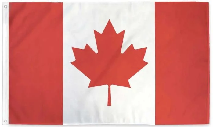
Canada
Adopted: February 15, 1965
Use: National Flag
Ratio: 1:2
Designed By: George F.G. Stanley
Design: A vertical triband of red (hoist-side and fly-side) and white (double width) with the red maple leaf centered on the white band.
Symbolism: The flag is horizontally symmetric and therefore the obverse and reverse sides appear identical. The width of the maple leaf is twice the height.
The white field is a Canadian pale (a central band occupying half of the width of a vertical triband flag, rather than a third of the width, named for its use in this flag); each bordering red field is exactly half its size and it bears a stylized red maple leaf at its center.
A ‘Great Flag Debate’ during the 1960s when the Egyptian government rejected Canadian peacekeeping forces on the grounds that the Canadian flag (the Red Ensign) contained the same symbols (the Union Jack) also used as a flag by the United Kingdom, one of the belligerents in the conflict. The goal for the design of the Canadian flag was to be distinctive and unmistakably Canadian.
-
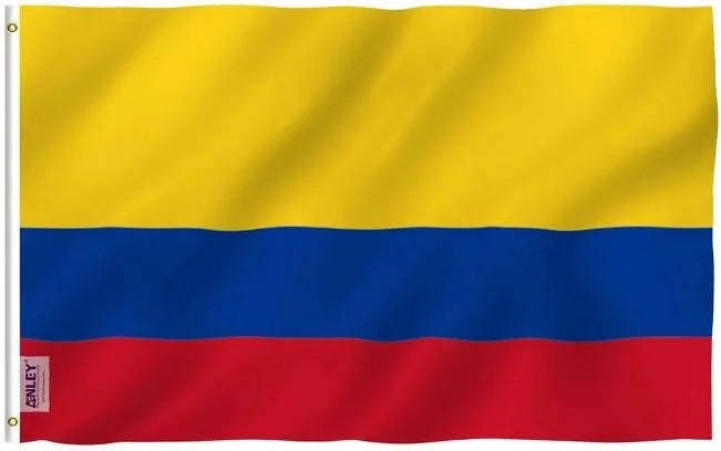
Colombia
Adopted: November 26, 1861
Use: National Flag
Ratio: 2:3
Design: An unequal horizontal tricolor of yellow, blue and red in a 2:1:1 ratio.
Symbolism: The yellow stripe takes up half of the flag while the blue and red stripes take up a quarter of the space each. The Colombian flag, the flag of Ecuador, and the flag of Venezuela are all derived from the flag of Gran Colombia. The stripes of the Colombia and Ecuadorian flags are different from most other tricolor flags because the three stripes are not equal sizes. By contrast, the flag of Venezuela is a more conventional tricolor due to its evenly sized stripes.
Yellow represents the riches of the country, the wealth of the Colombian Soil, the gold, sovereignty, harmony, justice and agriculture, as well as the Sun, the source of light.
Blue represents the sky above, the seas on Colombia’s shores, and the rivers that run through.
Red represents the blood spilled for Colombia’s independence and also the effort of Colombia people, their determination and perseverance. It represents that although Colombia’s people once struggled, they have since thrived.
-
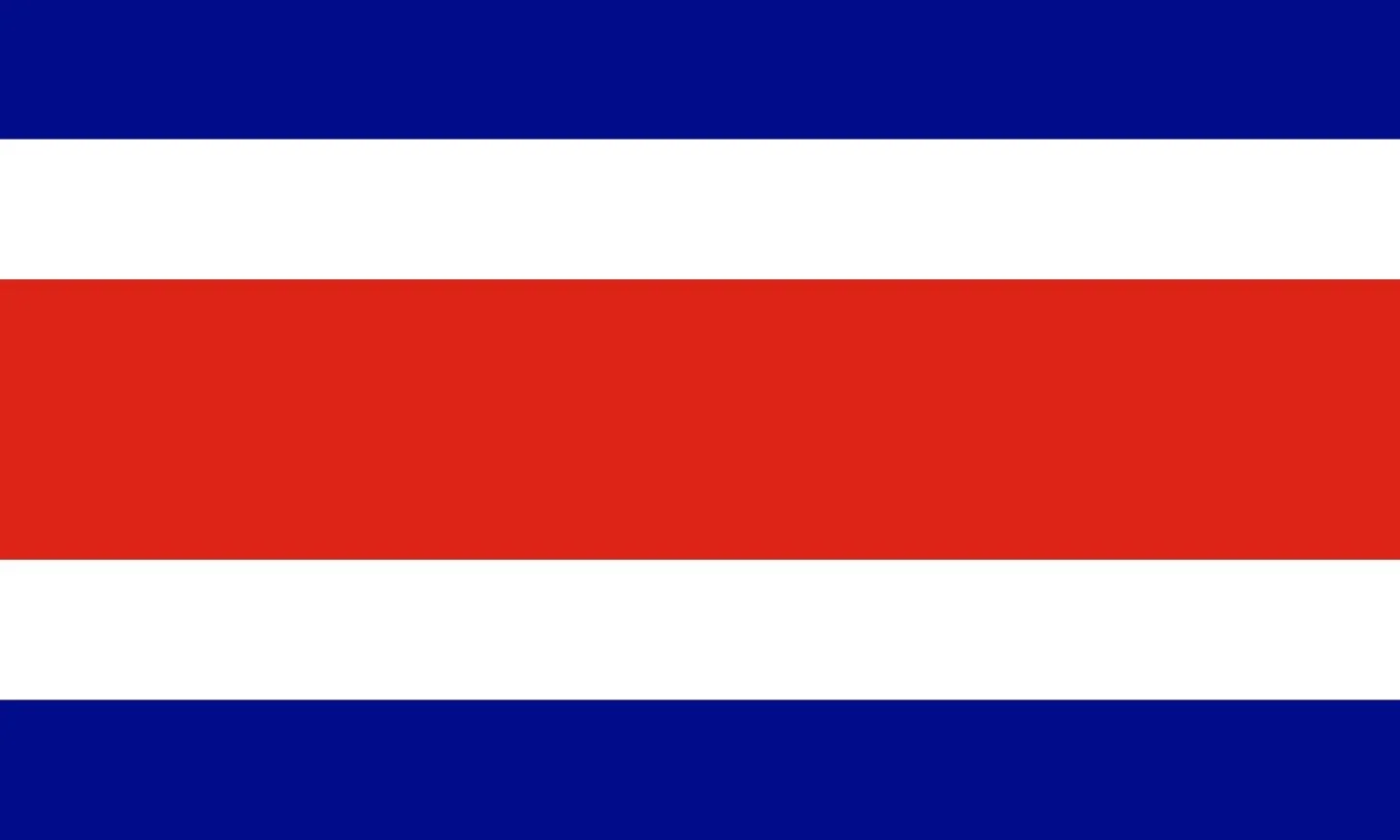
Costa Rica
Adopted: November 27, 1906
Use: National Flag
Ratio: 3:5
Designed By: Pacífica Fernández
Design: Five horizontal bands with two blue stripes, two white stripes, and a central red stripe which is twice as wide as each of the other four bands.
Symbolism: The colors of the flag share the ideals of the French Revolution of 1848: freedom, equality, and brotherhood. Blue means the sky, opportunities at reach, intellectual thinking, perseverance to accomplish a goal, infinite, eternity, and ideals of the religious and spiritual desires. White means clear thinking, happiness, wisdom, power and beauty of the sky, the driving force of initiatives to search for new endeavors, and the peace of Costa Rica. Red means “civilization of the century” and the sun casting on Costa Rica for the “first rays of its true independence, the warmth of Costa Rican people, their love to live, their bloodshed for freedom, and their generous attitude. The seven stars in the coat of arms represent the seven provinces of the republic.
-
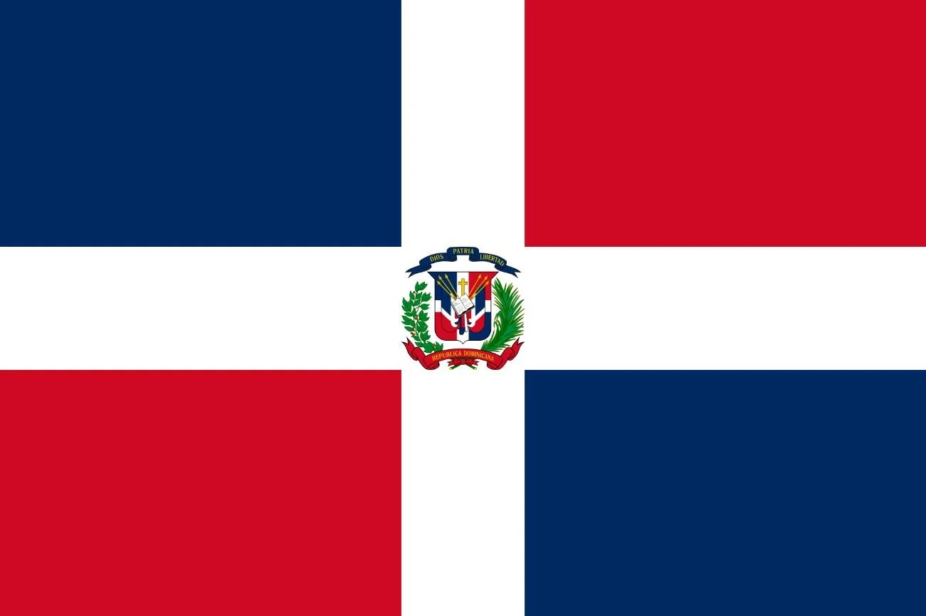
Dominican Republic
Adopted: November 6, 1863
Use: State Flag
Ratio: 2:3
Designed By: Juan Pablo Duarte
Design: A white cross with the national coat of arms in the center that divides the flag into four rectangles, blue and red at the top and red and blue at the bottom.
Symbolism: The blue stands for liberty, the white for salvation, and the red for the blood of heroes. The civil flag shows the same design, but without the charge in the center. The national coat of arms, featuring a shield with the flag design and supported by a bay laurel branch (left) and a palm frond (right), is at the center of the cross. Above the shield, a blue ribbon displays the national mottos Dios, Patria, Libertad (God, Homeland, Liberty). Below the shield, the words Republica Dominicana appear on a red ribbon. In the center of the shield, flanked by three spears on each side, is a Bible with a small crucifix above it and said to be opened to the Gospel of John, chapter 8, verse 32, which reads Y la verdad os hara libres (and the truth shall make you free).
-
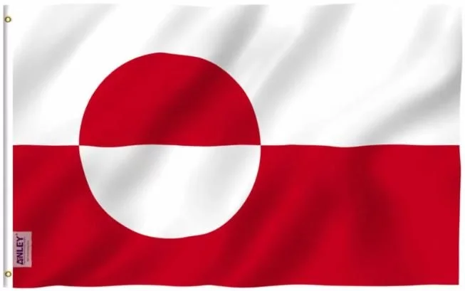
Greenland
Adopted: June 21, 1985
Use: National flag
Ratio: 2:3
Designed By: Thue Christiansen
Design: A horizontal bicolor of white and red, with a counterchanged disk slightly off-center towards the hoist.
Symbolism: The flag features two equal horizontal bands of white (top) and red (bottom) with a counter-changed red-and-white disk slightly to the hoist side of center. The colors of the flag are the same as those of the flag of Denmark, symbolizing Greenland’s place in the Danish realm.
-
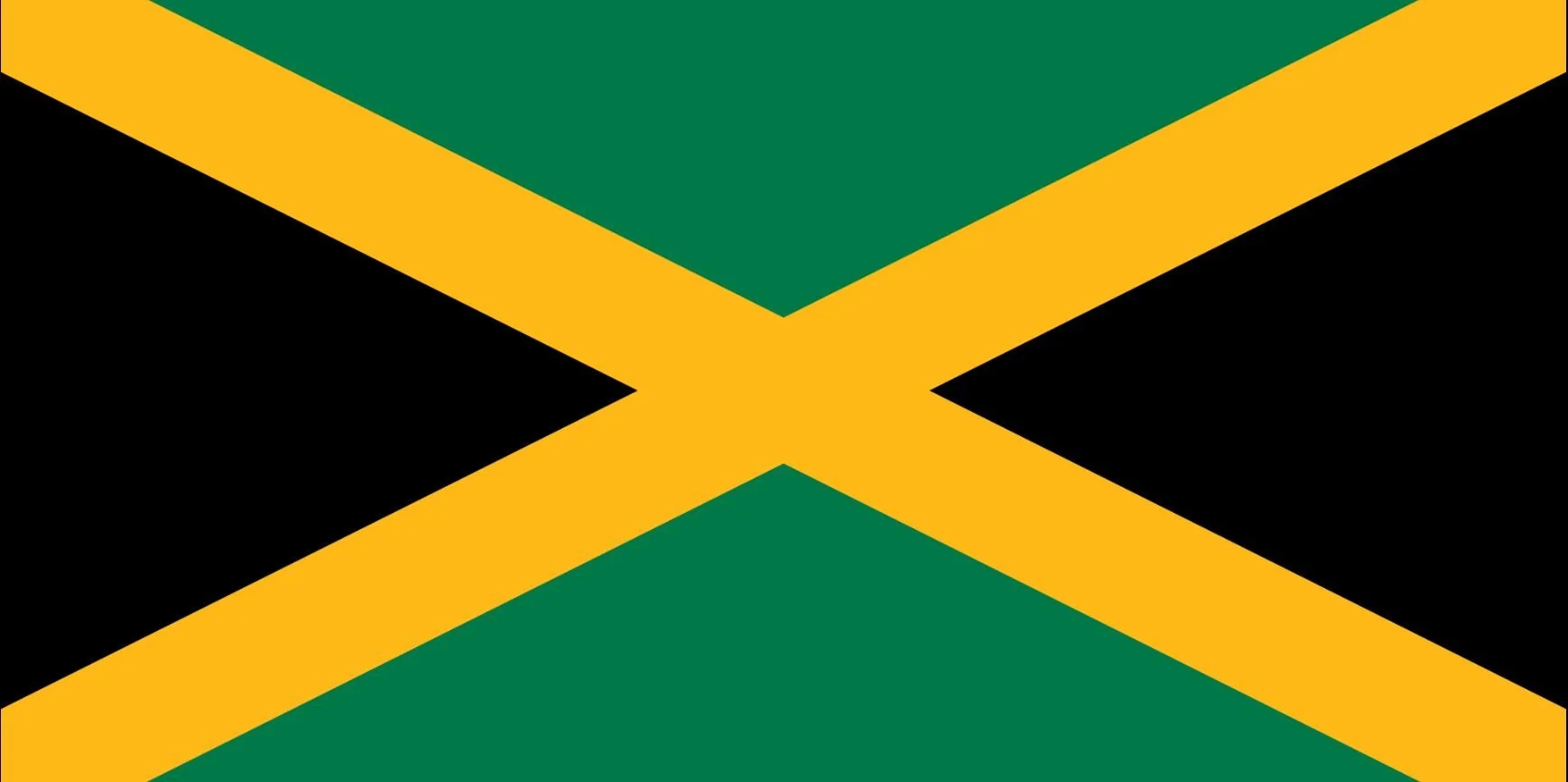
Jamaica
Adopted
August 6, 1962
Use
National Flag
Ratio
1:2
Adopted: August 6, 1962
Use: National Flag
Ratio: 1:2
Designed By: Jamaican House of Representatives
Design: A gold saltire divides the field into four triangles of green (top and bottom) and black (hoist-side and fly-side)
Symbolism: Early interpretations of the colors were that gold recalls the shining sun, black reflects hardships, and green represents the land. It was changed in 1966 to black representing the strength and creativity of the people which has allowed them to overcome difficulties, gold for the wealth of the country and the golden sunshine, and green for lush vegetation of the island, as well as hope.
-
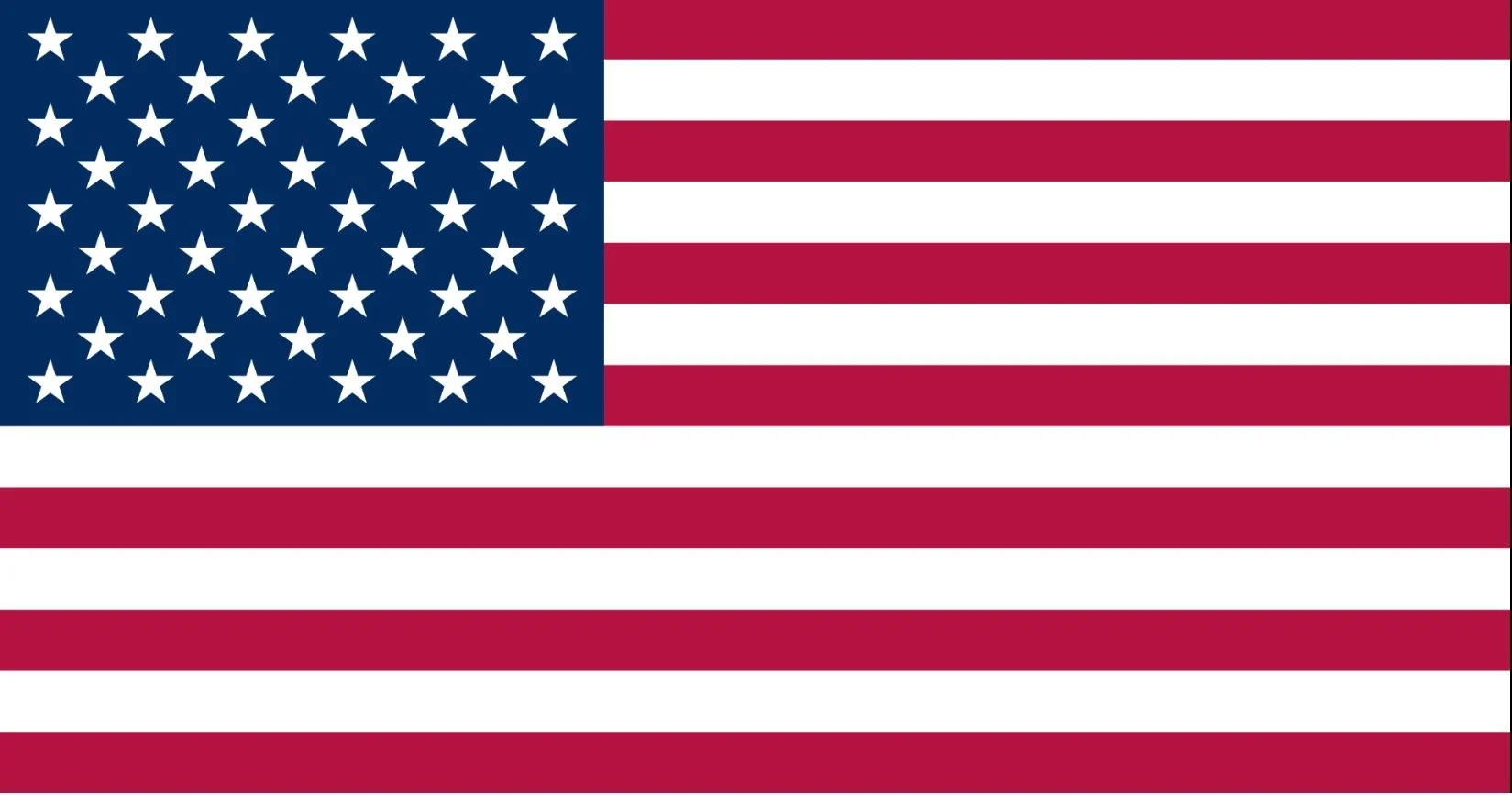
United States
Adopted: July 4, 1960 (current 50-star version)
Use: National Flag
Ratio: 10:19
Designed By: Francis Hopkinson
Design: Thirteen horizontal stripes alternating red and white; in the canton, 50 white stars of alternating numbers of six and five per horizontal row on a blue field.
Symbolism: The 50 stars on the flag represent the 50 U.S. states and the 13 stripes represent the thirteen British colonies that declared independence from Great Britain and became the first states in the U.S.
The current design of the U.S. flag is its 27th; the design of the flag has been modified officially 26 times since 1777. The 48-star flag was in effect for 47 years until the 49-star version became official on July 4, 1959. The 50-star flag was ordered by then President Eisenhower on August 21, 1959, and was adopted in July 1960. It is the longest-used version of the U.S. flag and has been for over 62 years.
-
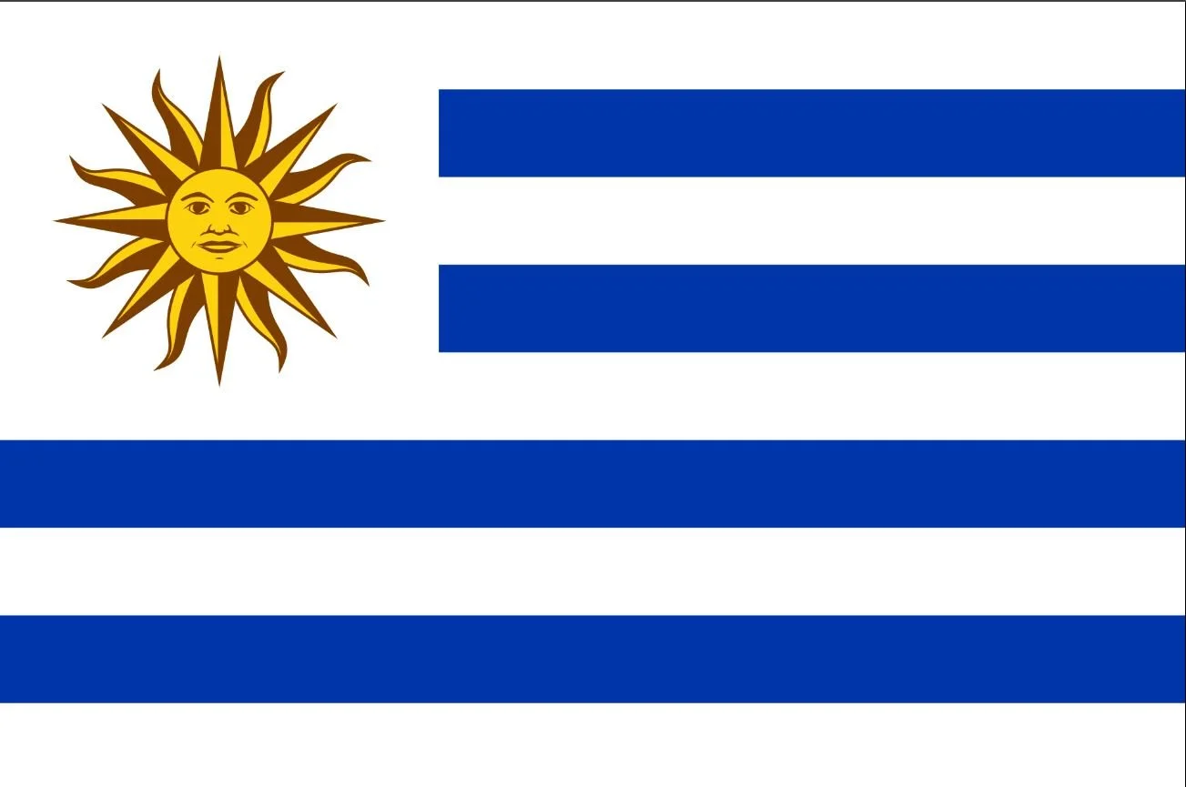
Uruguay
Adopted: July 11, 1830
Use: National Flag
Ratio: 2:3
Designed By: Joaquín Suárez
Design: Four horizontal stripes of blue with the upper hoist-side corner bearing the Sun of May in the center over a white canvas.
Symbolism: The horizontal stripes represent the nine original departments of Uruguay, taking inspiration from the U.S. flag. The stripes of blue and white were inspired by the flag of Argentina, making the flag of Uruguay part of both the Stars and Stripes and Belgrano flag families.
The golden Sun of May re[resents the May Revolution of 1810; the Sun of May is a figurative sun that represents Inti, the sun god and mythological founder of the Incan Empire. It also appears on the Flag of Argentina and the Coat of Arms of Bolivia.
Country Flags - Africa
-
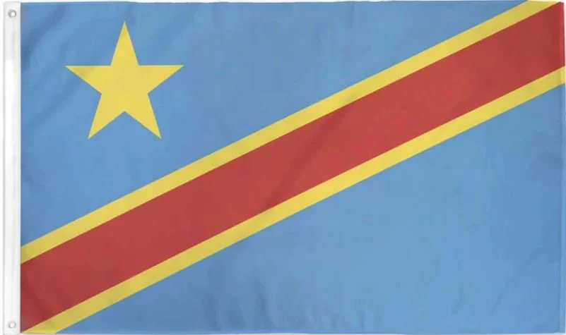
Democratic Republic of the Congo
Adopted: February 18, 2006
Use: National flag
Ratio: 3:4
Design: A sky blue field with a yellow five-pointed star in the canton and cut yellow-fimbriated red diagonal band from the lower house-side to upper fly-side.
Symbolism: The sky-blue field represents peace. The red diagonal stripe stands for “the blood of the country’s martyrs”. The stripe fimbriated by yellow symbolizes the country’s wealth. The yellow star is a symbol “of the future for the country.”
-
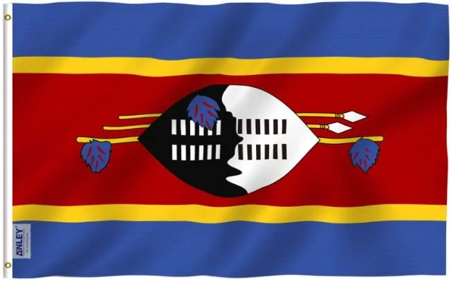
Eswatini
Adopted: October 6, 1968
Use: National flag
Ratio: 2:3
Designed By: King Sobhuza II
Design: A horizontal triband of blue (top and bottom) and the yellow-edged red (triple width) with the large black and white Nguni shield covering two spears and the staff decorated with the feather tassels called injobo (tassels-bunches of feathers of the widowbird and the lourie) all centered horizontally of the red band.
Symbolism: The central focus of the flag is a Nguni shield and two spears, symbolizing the protection from the country’s enemies. Its color is meant to show that white and black people live in peaceful coexistence in Eswatini.
The flag has five horizontal stripes - two blue stripes at the top and bottom while the center stripe is red, and two thin yellow stripes border the red stripe. On the red strip is an ox hide combat shield from the traditional Swazi Emabutfo Regiment, laid horizontally. The shield is reinforced by a staff from which hangs injobo tassels, which are only used by the king and two assegais above it.
-
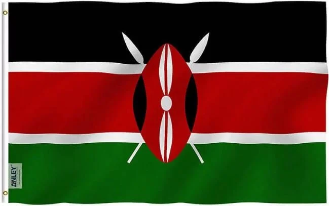
Kenya
Adopted: December 12, 1963
Use: National flag
Ratio: 2:3
Designed By: Tom Mboya
Design: A horizontal tricolor of black, white-edgd red, and green with two crossed white spears behind a red, white, and black Maasai shield.
Symbolism: The Kenyan flag includes symbols of unity, peace, and defence of the country. The color black represents the African continent, red represents the bloodshed during the fight for independence from British colonialism, and green represents the country’s landscape and natural wealth. The white fimbriation was added later to symbolize peace, honesty, purity, and innocence. The black, red, and white traditional African shield and two spears symbolize the defense of all the things mentioned above. Many of the colors and symbolic values are shared with the flag of South Sudan.
-
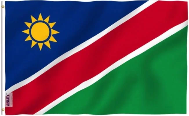
Namibia
Adopted: March 21, 1990
Use: National flag
Ratio: 2:3
Designed By: Theo Jankowski, Don Stevenson, Ortrud Clay
Design: A white-edged red diagonal band radiating from the lower hoist-side corner. The upper triangle is blue, charged with a gold sun with 12 triangular rays and the lower triangle is green.
Symbolism: The flag consists of a red band edged in two white bands with a blue upper triangle charged with a 12-ray yellow sun and green lower triangle. The National Symbols Sub-Committee received 870 entries for the national flag. Six designs were short-listed, further reduced to three designs from Namibians - Theo Jankowski of Rehoboth, Don Stevenson of Windhoek, and Ortrud Clay of Lüderitz. The three designs were combined to form the Namibia national flag.
-
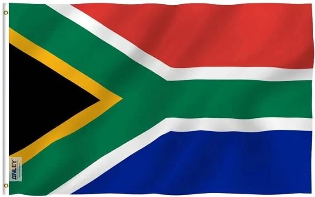
South Africa
Adopted: April 27, 1994
Use: Civil and State flag
Ratio: 2:3
Designed By: Frederick Brownell
Design: A horizontal bicolor of red and blue with a black isosceles triangle based on the hoist-side and a green pall, a central green band that splits into a horizontal Y, centered over the partition lines and was edged in both white against the red and the blue bands and yellow against the triangle, in which the arms of the Y ends at the corners of the hoist and embraces the triangle on the hoist-side.
Symbolism: According to the South African government, the flag is “a synopsis of principal elements of the country’s flag history.” Although different people may attribute personal symbolism to the individual colors or the color combinations, “no universal symbolism should be attached to any of the colors.” The only symbolism in the flag is the V or Y shape, which can be interpreted as “the convergence of diverse elements within South African society, taking the road ahead in unity.”
The flag consists of the four colors of the Vierkleur, expanded by the addition of black and gold signifying South Africa’s mineral wealth. Three of the colors - black, green, and gold - are found in the flag of the African National Congress. The other three colors - red, white, and blue - are used in the modern flags of the Netherlands and United Kingdom; the colors of white and blue were also found on the old flag of South Africa.
Country Flags - Asia & Australia
-
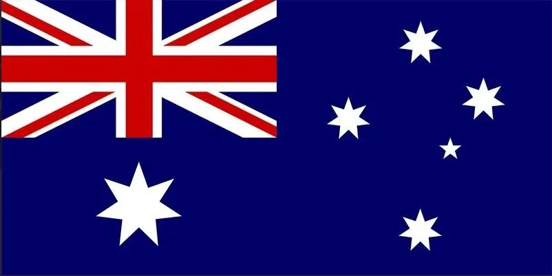
Australia
Adopted: December 8, 1908
Use: National Flag
Ratio: 1:2
Designed By: Annie Dorrington, Ivor Evans, Lesley Hawkins, Egbert Nutall and William Stevens
Design: A Blue Ensign (blue field with the Union Jack in the upper hoist quarter) defaced with the Commonwealth Star (7-pointed stair) in the lower hoist quarter and the five stars of the Southern Cross in the fly half.
Symbolism: The Australian flag uses three prominent symbols: the Union Jack, the Commonwealth Star, and the Southern Cross.
The Union Jack is based on the Union Flag, which incorporates the red St. George’s Cross of England, the white diagonal St. Andrew’s Cross of Scotland, and the red diagonal St. Patrick cross of Ireland. The Union Flag is thought to symbolize Australia’s history as six British colonies and the principles upon which the Australian Federation is based.
The Commonwealth Star, also known as the Federation Star, originally had six points, representing the six federating colonies. In 1908, a seventh point was added to symbolize the Territory of Papua, and any future territories.
The Southern Cross is one of the distinctive constellations visible in the Southern Hemisphere, and has been used to represent Australia since the early days of the British Settlement. One of the flag’s designers intended the Southern Cross to also refer to the four moral virtues ascribed to the four main stars by Dante: justice, prudence, temperance, and fortitude.
-
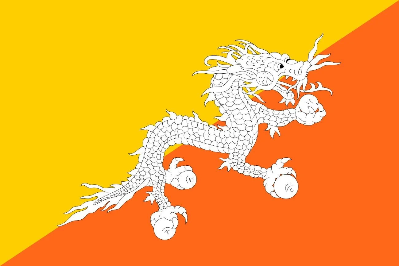
Bhutan
Adopted: 1969
Use: National Flag
Ratio: 3:2
Designed By: Mayum Choying Wangmo Dorji
Design: Divide diagonally from the lower hoist-side corner to the upper fly-side corner; the upper triangle is yellow and the lower triangle is orange, with a white dragon holding four jewels in its claws centered along the dividing line and facing away from the hoist side.
Symbolism: Yellow signifies civil tradition and temporal authority as embodied in the Druk Gyalpo, the Dragon King of Bhutan, whose royal garb traditionally includes a yellow kabney (scarf). Orange signifies Buddhist spiritual tradition, particularly the Drukpa Kagyu and Nyingma schools.
The dragon spreads equally over the line between the flag’s two colors signifies the equal importance of both civic and monastic traditions in the Kingdom of Druk (Bhutan) and evokes the strength in the sacred bond between sovereign and people.
The dragon’s white color signifies the purity of inner thoughts and deeds that unite ethnically and linguistically diverse peoples of Bhutan. The jewels held in Druk’s claws represent Bhutan’s wealth and the security and protection of its people, while the dragon’s snarling mouth symbolizes Bhutanese deities’ commitment to defense of Bhutan.
-
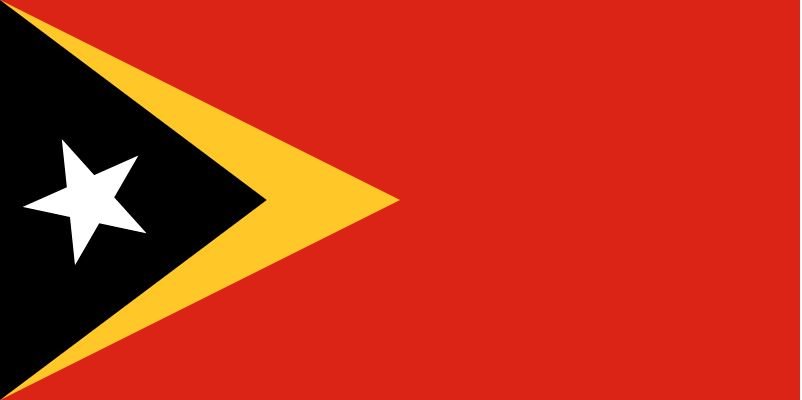
East Timor
Adopted: November 28, 1975
Use: National Flag
Ratio: 1:2
Designed By: Natalino Leitão
Design: A red field with a black isosceles triangle based on the hoist-side bearing a white five-pointed star in the center superimposed on the larger yellow triangle, also based on the hoist-side, that extends to the center of the flag.
Symbolism: At the time of adoption in 1975, the symbolism of the flag was given the following meaning: Black represents the four centuries of colonial oppression; Yellow arrowhead represents “the traces of colonialism in East Timor’s history”and the struggle for independence; Red stands for the spilled blood of the population; The white star symbolizes the hope for a better future.
The new Constitution of the Democratic Republic of Timor-Leste of 2002: Black symbolizes obscurantism, which must be overcome; Yellow represents the wealth of the country; Red symbolizes the struggle for national liberation; The white star, or “the light that guides”, represents peace.
-
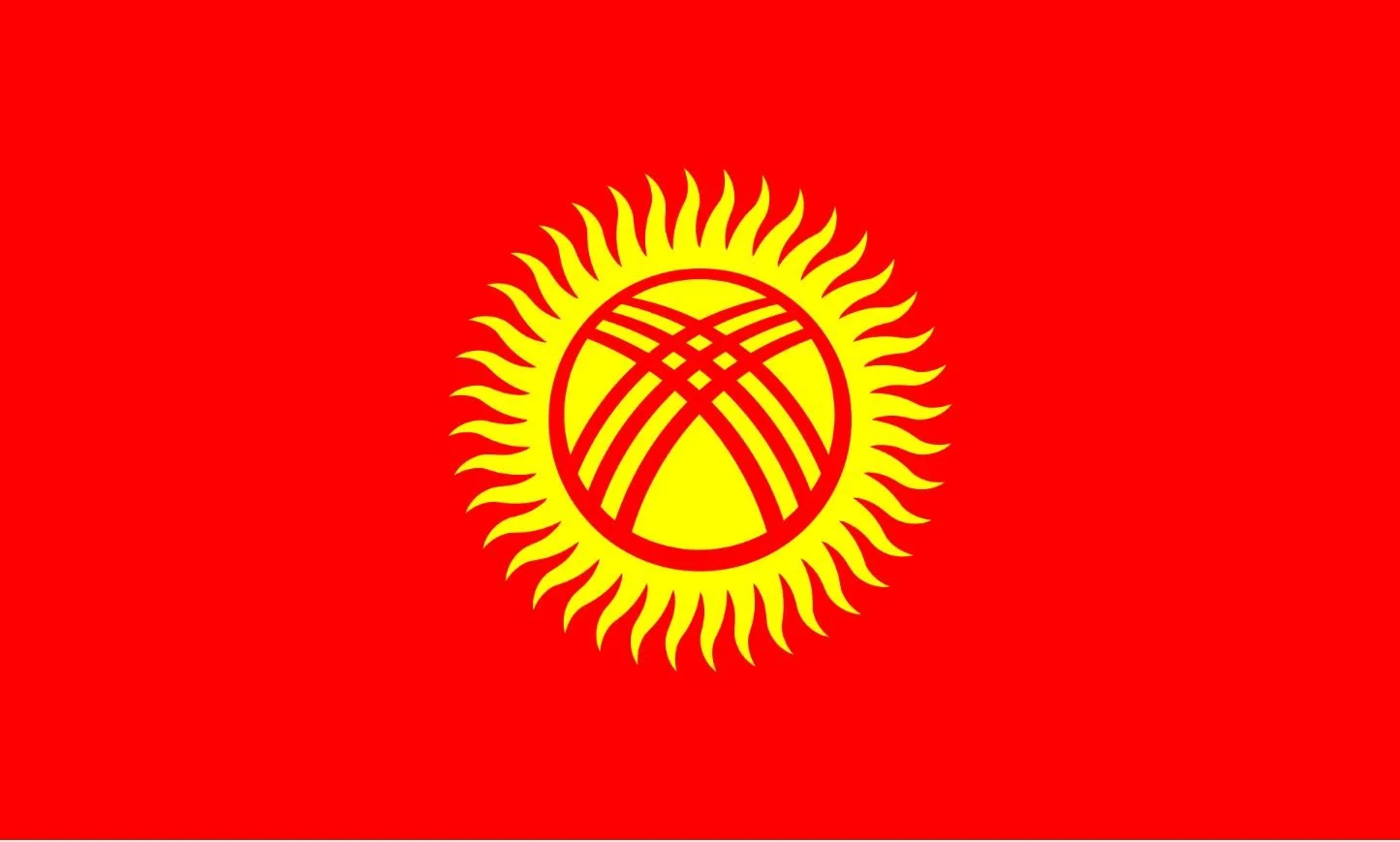
Kyrgyzstan
Adopted: March 3, 1992
Use: National flag and ensign
Ratio: 3:5
Designed By: Zhogorku Kengesh (Parliament of Kyrgyzstan)
Design: A red flag charged with a yellow sun with forty uniformly wavy rays, representing the forty clans united in legend by Manas; the sun is crossed by two sets of four lines, representing the traditional Krygyz yurt.
Symbolism: The colors and symbols of the flag carry cultural, political, and regional meanings. The red field stands for “bravery and valor”, and alludes to the purported emblem hoisted by Manas, the national hero of Kyrgyzstan. The sun epitomizes peace and prosperity, while its 40 rays stand for the number of tribes united by Manas to fight against the Mongols, as well as the number of followers he had.
The center of the sun features a stylized illustration of the roof (tunduk) atop a traditional Kyrgyz tent (yurt) when viewed from the interior. Although these tents are less commonly used today, its incorporation into the flag is meant to symbolize the “origin of life”, the “unity of time and space”, as well as the people’s “hearth and home” and their history.
-
![]()
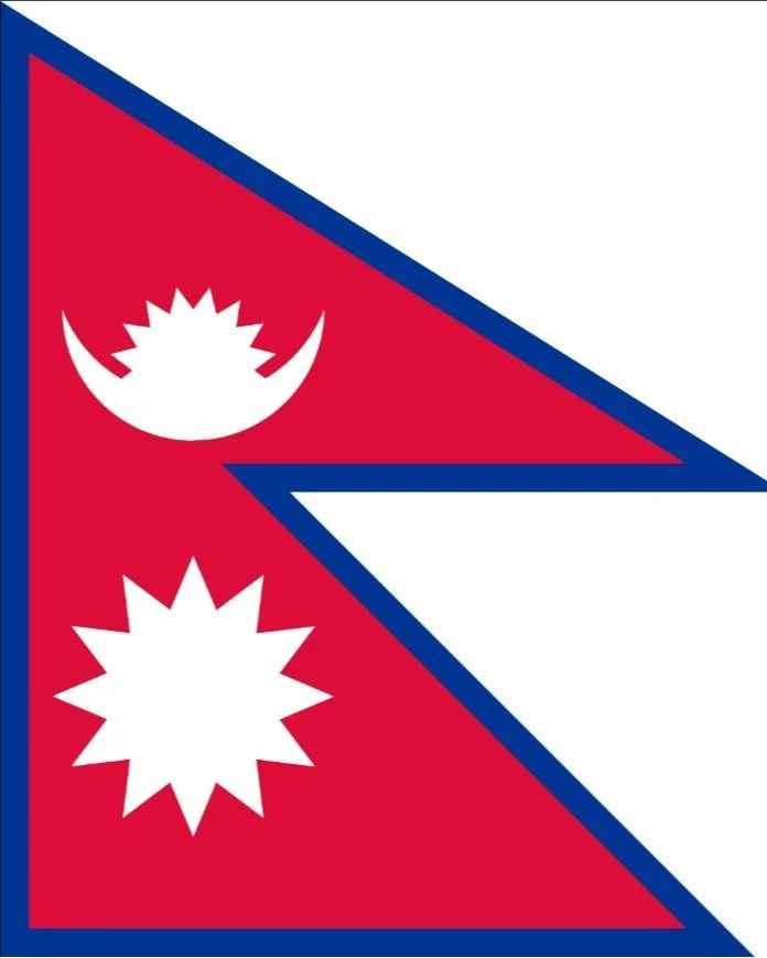
Nepal
Adopted: December 16, 1962
Use: National Flag
Ratio: See Below
Designed By: Shakar Nath Rimal
Design: The national flag of Nepal consists of two juxtaposed triangular figures with a crimson-colored base and deep blue borders, there being a white emblem of the crescent moon with eight rays visible out of sixteen in the upper part and a white emblem of a twelve rayed sun in the lower part.
Symbolism: The national flag of Nepal is the only non-rectangular flag that acts as both the state flag and the civil flag of a sovereign country. The flag is a simplified combination of two single pennons (or pennants), known as a double-pennon.
The crimson red is the symbol of bravery and it is also the country’s national color, which is the color of the rhododendron, Nepal’s national flower. The blue border represents peace and harmony.
The inclusion of the celestial bodies indicates Nepal’s permanence and the hope that Nepal will enjoy the same longevity as the Sun and the Moon.
The moon also symbolizes the cool weather of the Himalayas, whereas the sun symbolizes the heat and the high temperature of the southern lowlands. The stylized moon represents the calm demeanor and purity of the spirit of the Nepali people, while the stylized sun represents their fierce resolve.
-
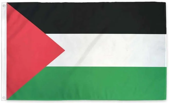
Palestine
Adopted: May 28, 1964
Use: National Flag
Ratio: 1:2
Designed By: Unknown
Design: A horizontal tricolor of black, white, and green; with a red triangle based at the hoist.
Symbolism: The origins of the flag are the subject of dispute and mythology. In one version, the colors were chosen by the Arab nationalist 'Literary Club' in Istanbul in 1909, based on the words of a 13th century Arab poet Safi al-Din al-Hili:
“Ask the high rising spears of our aspirations
Bring witness the swords, did we lose hope
We are a band, honor halts our souls
Of beginning with harm, those who won't harm us
White our deed, black are our battles,
Green are our fields, red are our swords. “
-
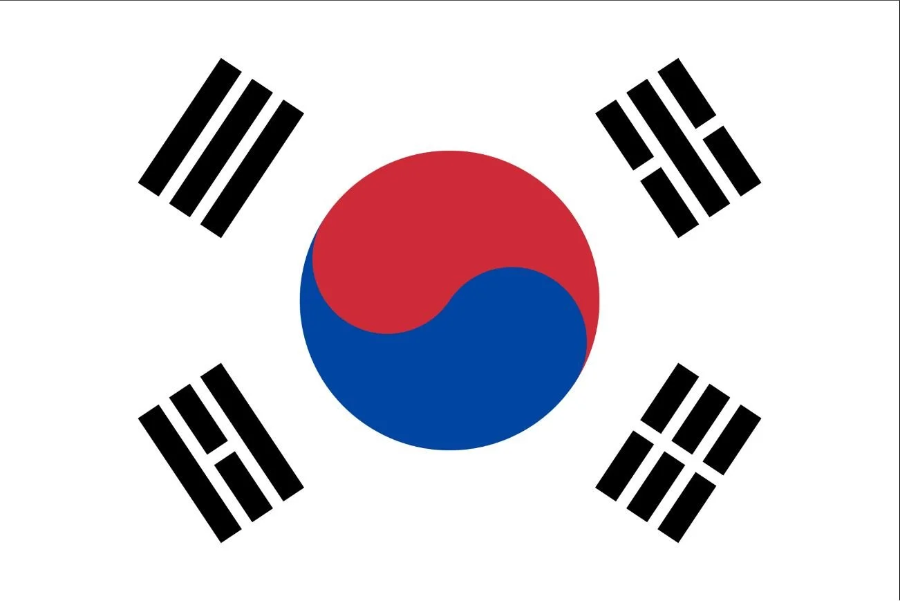
South Korea
Adopted: May 30, 2011
Use: National Flag
Ratio: 2:3
Designed By: Lee Eung-jun
Design: A white field with a centered red and blue taegeuk surrounded by four trigrams.
Symbolism: The national flag of South Korea, also known as Taegeuki, has three parts: a white rectangular background, a red and blue Taegeuk in its center, accompanied by four black trigrams, one in each corner.
The trigrams represent movement and harmony as fundamental principles. Each trigram represents one of the four classical elements. The symbols starting from the top left corner mean:
Geon - heaven/spring/east/humanity/father/heaven/justice
Gon - earth/summer/west/righteousness/mother/earth/vitality
Gam - moon/winter/north/intelligence/son/water/wisdom
Ri - sun/autumn/south/courtesy/daughter/fire/fruition
Country Flags - Europe
-
Germany
Adopted: May 23, 1949
Use: Civil Flag; Government Flag
Ratio: 3:5
Designed By: West German Government
Design: A tricolor consisting of three equal horizontal bands of black, red, and gold.
Symbolism: Out of the blackness (black) of servitude through bloody (red) battles to the golden (gold) light of freedom.
Members of the corps during the Napoleonic Wars were required to supply their own clothing. In order to present a uniform appearance it was easiest to dye all clothes black. Gold-colored buttons were widely available, and pennons used by the lancers in the unit were red and black.
The government flag is the civil flag defaced with the Bundesschild (“Federal Shield ''), which overlaps with up to one fifth of the black and gold bands. The Bundesschild is a variant of the coat of arms of Germany, whose main differences are the illustration of the eagle and the shape of the shield. The Bundesschild is rounded at the base, whereas the standard coat of arms is pointed.
-
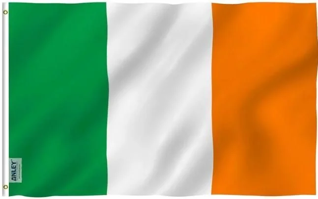
Ireland
Adopted: 1922
Use: National Flag
Design: A vertical tri-color of green, white, and orange.
Symbolism: The green pale of the flag symbolizes Roman Catholics, the orange represents the minority Protestants who were supporters of William of Orange. The white in the center signifies a lasting peace and hope for union between Protestants and Catholics in Ireland. The flag, as a whole, is intended to symbolize the inclusion an hoped-for union of the people of different traditions on the island of Ireland, which is expressed in the Constitution as the entitlement of every person born in Ireland to be part of the independent Irish nation, regardless of ethnic origin, religion or political conviction.
-
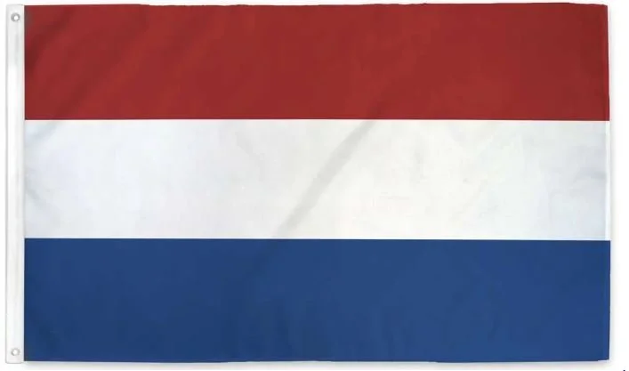
Netherlands
Adopted: 1596
Use: National flag
Ratio: 2:3
Design: A horizontal triband of red, white, and cobalt blue.
Symbolism: The red band symbolizes bravery, strength, valor, and hardiness; the white band, peace and honesty; and the blue band represents vigilance, truth, loyalty, perseverance, and justice.
Another theory is that the colors used to be a symbol of society: red represents the people, white the church, and blue the nobility.
-
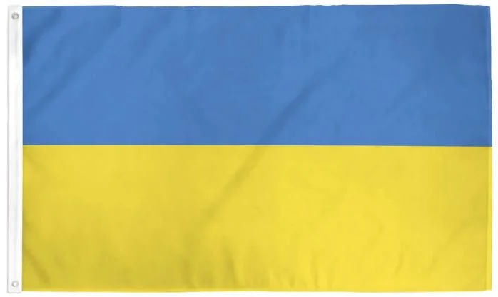
Ukraine
Adopted: March 22, 1918; restored August 24, 1991
Use: National flag
Ratio: 2:3
Designed By: Unknown
Design: A horizontal bicolor of equally sized blue and yellow bands
Symbolism: The roots of Ukrainian national symbols come from pre-Christian times when yellow and blue prevailed in traditional ceremonies, reflecting fire and water.
During Soviet rule, the Ukrainian flag was banned and anyone displaying it could be criminally prosecuted for “anti-Soviet propaganda”.
The first flag of the Ukrainian Soviet Socialist Republic was adopted on March 10, 1919, to serve as the symbol of Soviet Ukraine. The first flag of the Ukrainian S.S.R was a red field with a yellow-blue Ukrainian flag in the canton.
-
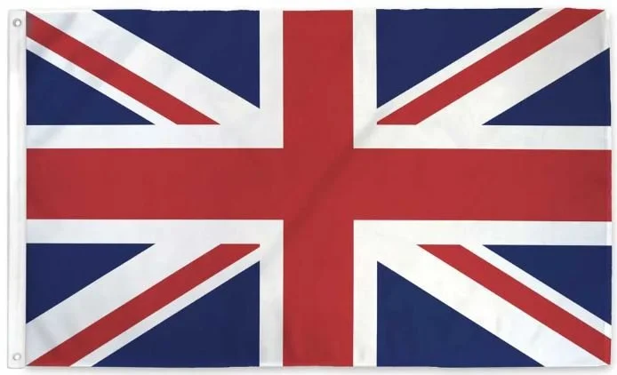
United Kingdom
Adopted: January 1, 1801
Use: National Flag
Ratio: 1:2; alternate ratio 3:5
Designed By: Unknown
Design: A white-fimbriated symmetric red cross on a blue field with a white-fimbriated counterchange saltire of red and white.
Symbolism: The design of the Union Jack consists of the red cross of St. George (patron saint of England, which also represents Wales), edged in white, superimposed on the saltire of St. Patrick (patron saint of Ireland), also edged in white, which are superimposed on the saltire of St. Andrew (patron saint of Scotland). Wales is not represented in the Union Flag by Wales’ patron saint, St. David, because the flag was designed while Wales was part of the Kingdom of England.
The flag proportions on land and the war flag used by the British Army have the proportions 3:5 while the flag’s height-to-length proportions at sea are 1:2.
Flags for Causes
-
![]()
Autistic Pride
Adopted: June 18, 2005 (First celebration of Autism Pride Day)
Use: Pride Flag
Designed By: Autism Rights Group Highland (ARGH)
Design: Rainbow infinity symbol on a yellow field
About: Autistic Pride Day is a pride celebration for autistic people held on June 18th each year. Autistic pride recognizes the importance of pride for autistic people and its role in bringing about positive changes in the broader society.
The infinity symbol represents neurodiversity, the rainbow represents the pride movement. Gold is used by autistic advocates as a chemical symbol for gold is Au. Gold is promoted as an alternative to non-autistic-led groups designating colors such as blue as a symbol for autism.
The rainbow infinity symbol is used as the symbol of Autistic Pride Day, representing “diversity with infinite variations and infinite possibilities”. The purpose of Autistic Pride is to show to the world that we are proud of being autistic and that we are not diseased or defective or in need of a cure. We have as much right to live a happy and fulfilled life as neurotypicals.
-
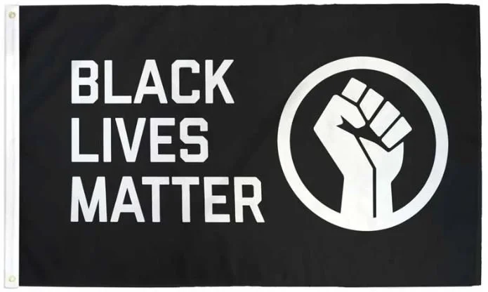
Black Lives Matter
Adopted: July 2013
Use: Cause
Design: The words "BLACK LIVES MATTER" in white on the hoist edge with a white raised fist enclosed in a circle on a blue field.
Symbolism: Black Lives Matter is a decentralized political and social movement that seeks to highlight racism, discrimination, and racial inequality experienced by Black people. Its primary concerns are incidents of police brutality and racially motivated violence against Black people.
The movement began in the wake of the killings of Trayvon Martin, Michael Brown, Eric Gardner, and Rekai Boyd, among others.
-
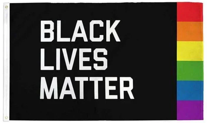
Black Lives Matter Pride
Movement Began: July 2013
Use: Pride Flag
Design: The words “BLACK LIVES MATTER” in white on a black field with a rainbow pattern - red, orange, yellow, green, blue, and purple - on the fly side.
About: Black Lives Matter is a decentralized political and social movement that seeks to highlight racism, discrimination, and racial inequality experienced by Black people. Its primary concerns are incidents of police brutality and racially motivated violence against Black people.
The movement began in the wake of the killings of Trayvon Martin, Michael Brown, Eric Gardner, and Rekai Boyd, among others.
-
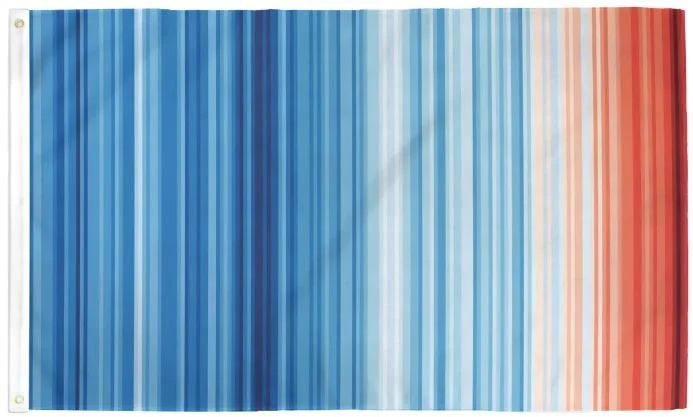
Climate Warming Stripes
Use: Activism
Design By: Ed Hawkins, Climatologist
Design: Vertical stripes vary in color and width with a progression from light blue to white to red.
About: Known as the “Warming Stripes” or “Climate Stripes”, is a visual representation of the warming of our planet’s warming over time. The progression from blue (cooler) to red (warmer) stripes portrays the long-term increase of average global temperature from 1850 (hoist side of the flag) to 2018 (fly edge). This graph is a beautiful way to display a terrifying reality.
-
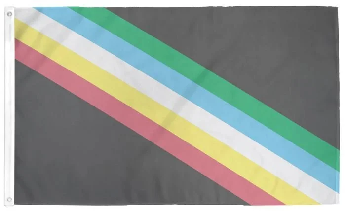
Disability Pride
Adopted: 2021
Use: Cause
Designed By: Ann Magill
Design: The design features a black field with a straight diagonal band with muted colors from the top left to the bottom right corner; colors from left to right include red, gold, white, blue, and green.
Symbolism: The parallel stripes stand for an intracommunal solidarity. The colors on the flag symbolize various disability experiences. The black background mourns disabled people who have died due to negligence, suicide, rebellion, illness, and eugenics. The stripe's colors represent the following:
Red: physical disabilities
Gold: cognitive and intellectual disabilities
White: non visible and undiagnosed disabilities
Blue: psychiatric disabilities
Green: sensory disabilities
-
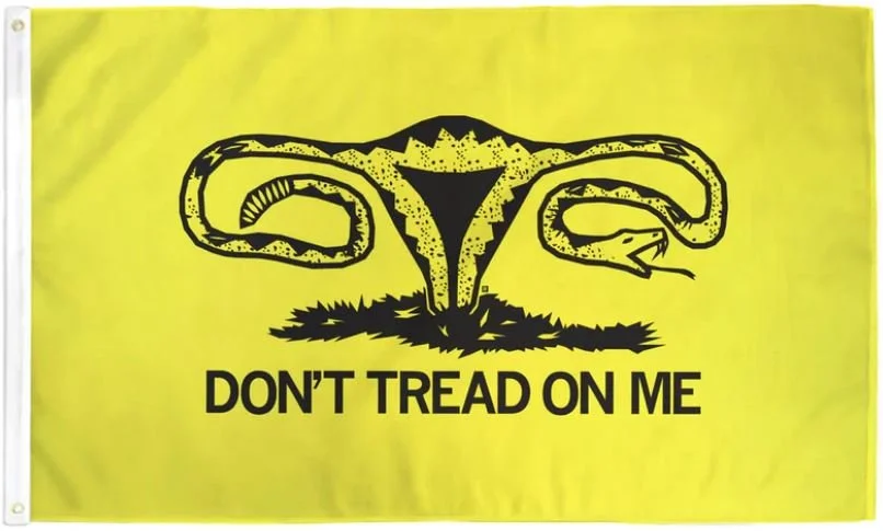
Don't Tread On Me Uterus
Use: Cause
Design: A uterus with a snake head and tail in place of the ovaries and the black text “DON’T TREAD ON ME” on a yellow field.
Symbolism: The “Don’t Tread on Me Uterus” flag is a symbol of women’s rights and pro-choice support. It combines the historic American phrase “Don’t Tread on Me” with the image of a uterus to represent a woman's right to bodily autonomy and reproductive freedom.
The “Don’t Tread on Me” phrase originated as the motto on the Gadsden flag during the American Revolution. The flag featured a coiled rattlesnake on a yellow background, the rattlesnake symbolized anti-British and pro-revolution sentiments.
-
-
Mental Health
Use: Awareness
Designed By: Pete Foundation
Design: A dark green quarter circle in the bottom hoist-side quadrisection with green, light green, and yellow quarter circles radiating out from the dark green quarter circle.
Symbolism: Green is already the established color for mental health awareness, and for that reason the base of the flag. The design of the flag reflects a sunrise and the shift from dark to light through brighter shades of color. These shades also represent the various states of our emotional or psychological life. The value of the simple design is to make it more relatable, replicable, and transcultural.
-
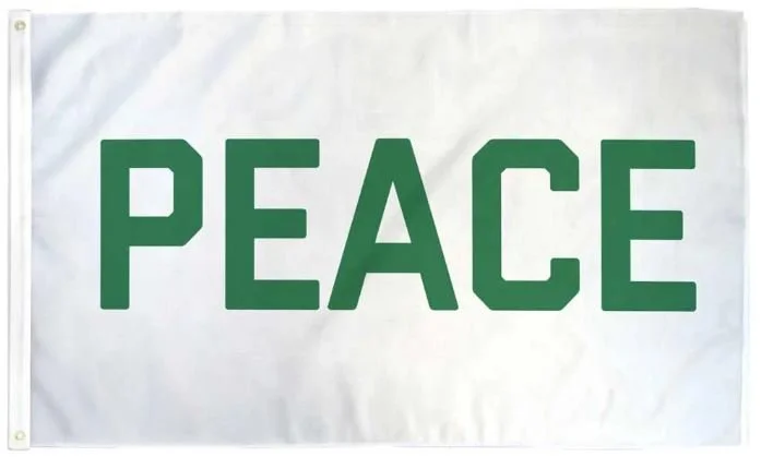
Peace
Use: Call to Action
Designed By: Flags for Good
Design: The word PEACE in green on a white field.
Symbolism: This Peace flag, while not the official Peace flag, is a simple design with a simple message. The white field symbolizes the white flag associated with surrender and the green words symbolize the earth we share.
-
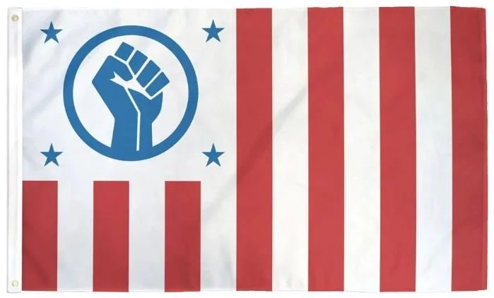
Resist
Use: Cause
Designed By: Flags for Good
Design: Thirteen vertical stripes alternating red and white; in the canton, a blue raised fist centered with four blue stars in the corners on a white field.
Symbolism: The creator wanted to redesign a "Resist" flag without using the actual word. The change in the direction of the stripes is a nod to the suppositious "US Civil Flag", which kept the flag within U.S. flag code standards without disrespecting the U.S. flag. The raised fist is a custom design used in various other designs. The four stars in the corners is a subtle nod to the suffragette protest flag.
-
Rise Up
Use: Cause
Designed By: Morgan Boyer, Flags For Good
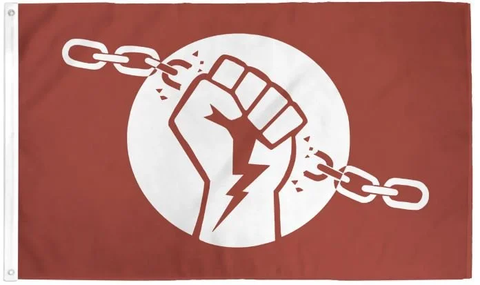
Design: Raised fist with a lighting bolt from the palm to the wrist, shown breaking a chain on a rust field while the design is white.
Symbolism: The creator designed the flag with inclusivity in mind and in doing so created a visual reminder that all of our struggles are connected. The rust color symbolizes the age of the issue, no longer a new battle but one that has spanned generations. The broken chain represents breaking free of oppressive authority.
The Black Panther Party was founded by Huey and Bobby Seal in 1966 to challenge police brutality against the African American community; the black power fist was repeatedly used as a symbol of Black liberation. The BLM movement of 2020 moved something deep within people, propelling the fist to be a rebuff of unjust authority and an act of collective resistance.
The lighting bolt is a nod to the 2021 feminist strike in Poland following a near total ban on abortion. Graphic designer, Ola Jasionowska, coined the symbol with the note that the lightning bolt represented those who were assigned female at birth regardless of their place of residence, character, or expression as a symbol of caution, and opposition to fascist behavior.
The circle represents unity and that we are all in this together.
-
Thin Dew Line
Use: Cause
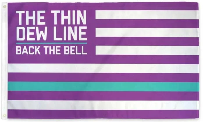
Design: Thirteen horizontal stripes alternating purple and white, with the white strip second from the bottom is replaced with a turquoise band; in the canton are the words "The Thin Dew Line | Back the Bell'' on a purple field.
Symbolism: The "Baja Blast" stripe symbolizes the thin line our brave fast-food workers create between our hunger and ourselves.
-
Tyranny Shall Not Prevail
Use: Cause
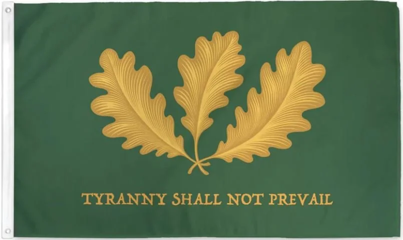
Design: A green field with three gold oak leaves with the text “TYRANNY SHALL NOT PREVAIL”.
Symbolism: The flag pays homage to the revolutionary spirit of the 18th century, featuring a trio of oak leaves that symbolize strength, endurance, and resilience. Beneath the leaves, the power declaration “TYRANNY SHALL NOT PREVAIL” serves as an enduring rally cry for liberty, justice, and resistance.
-
-
We Believe
Adopted: 2016
Use: Cause
Designed By: Kristin Garvey
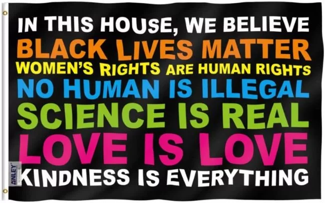
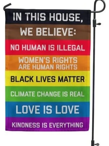
Design: The words “In this House We Believe” in white text, “Black Lives Matter” in orange text, “Women’s Rights are Human Rights” in yellow text, “No Human is Illegal” in blue text, “Science is Real” in green text, “Love is Love” in pink text, and “Kindness is Everything” in white text, all on a black background.
Symbolism: The We Believe yard sign was created in response to Donald Trump winning the presidential election, in anticipation of the various groups that would be negatively affected by Trump’s presidency, and attempting to find quotes from liberal activists and politicians in support of such groups.
Garden Flags
-
-
![]()
-
![]()
-
-
![]()
-
![]()
-
![]()
-
![]()
-
![]()
-
![]()
-
![]()
-
![]()
-
![]()
-
![]()
-
![]()
-
![]()
-
![]()
-
![]()
-
![]()
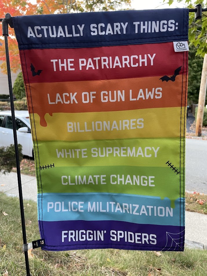
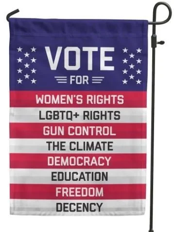
What You're Voting For
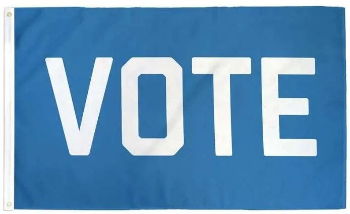
About: A vertical banner reminding all who ask by that it is time to do or civic duty, and save our democracy once again. This one lists what is on the ballot and why they should get out and vote.
VOTE FOR
Women’s Rights
LGBTQ+ Rights
Gun Control
The Climate
Demcracy
Education
Freedom
Decency
Historical Flags
-
Bunker Hill
Adopted: 17th Century
Use: Regional and Cultural
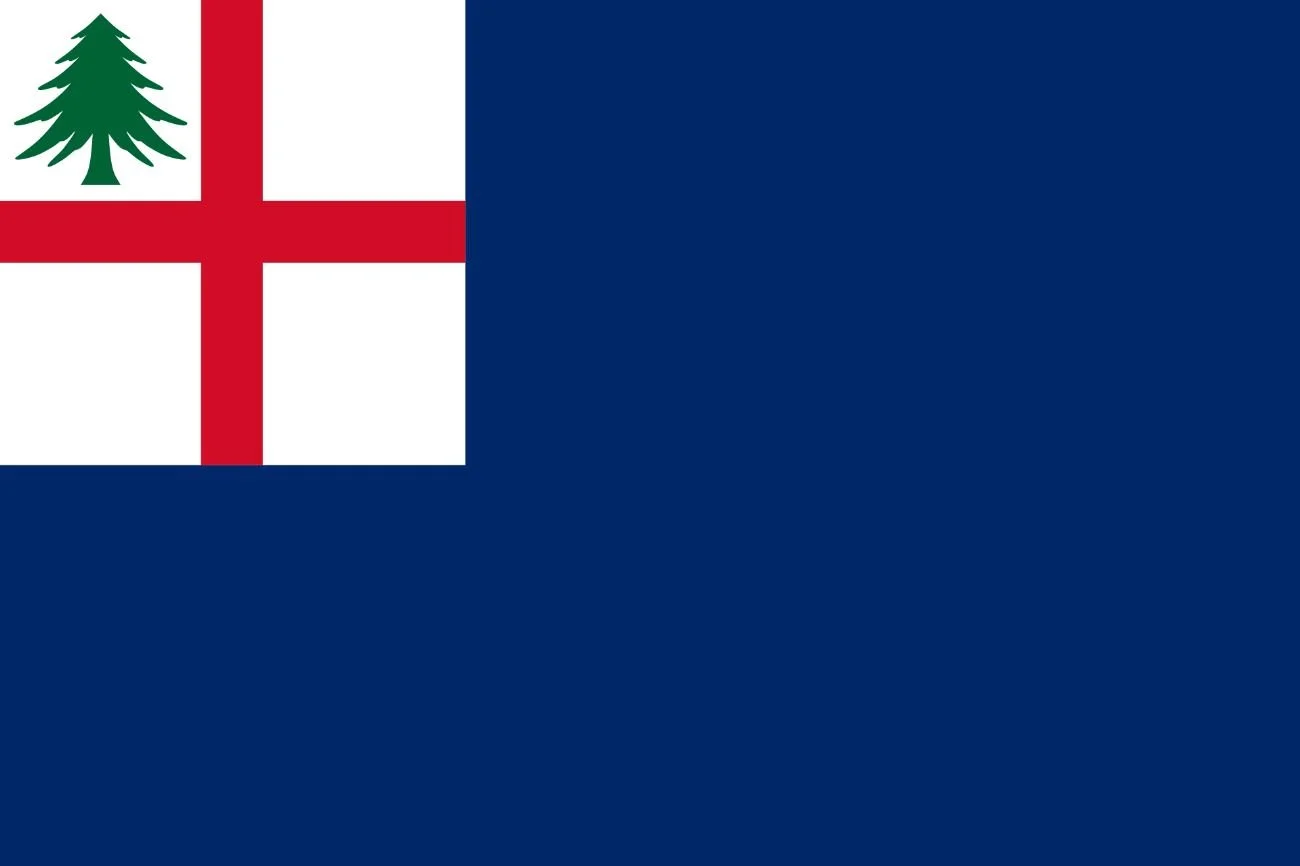
Design: Blue ensign with St. George’s Cross in the Canton and an image of a pine tree in the top left corner
Variations: Red ensign with a pine tree over a white field in the canton
Red ensign with St. George’s Cross in the canton with a pine tree in the top left corner
Blue ensign with St. George’s Cross in the canton with a pine tree in the top left corner and defaced with six stars symbolizing the six states of New England.
History: The Bunker Hill flag is a variant of the New England flag. The flag of New England has two prominent symbols: a pine tree and red color. Other features, like the St. George’s Cross, are not always displayed on the flag, but the pine almost always is.
The red ensign was a common banner for other American colonies as well, but the addition of the pine tree distinguished the New England colonies from their neighbors.
-
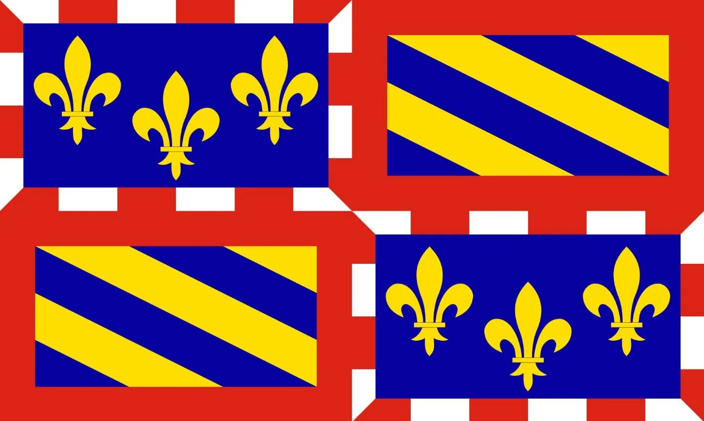
Burgundy, France
Adopted: 1004
Use: Historic
Ratio: 2:3
Derived from: Burgundy Coat of Arms
Design: The first and four quarters of the banner are the arms of the second house of Burgundy (1363-1482), the arms of Touraine. The second and third quarters are the first house of Burgundy (1032-1061)
Symbolism: It is named for the Burgundians, an East Germanic people who moved westwards beyond the Rhine during the late Roman period. The name Burgundy has historically denoted numerous political entities. It first emerged in the 9th century as one of the successors of the ancient Kingdom of the Burgundians, which after its conquest in 532 had formed a constituent part of the Frankish Empire.
Since the inception of the French departmental system in 1790, Burgundy has referred to the geographic area comprising the four departments of Côte-d'Or, Saône-et-Loire, Yonne, and Nièvre.
-
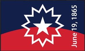
Juneteenth
Designed: 1997
Use: Commemorating the Juneteenth Holiday
Ratio: 2:3
Designed By: Ben Haith
Design: Upper half is blue and the lower half is red. Colors are divided by a horizontal arch. In the center is a five-point white star which is outlined with a 12-point star.
Symbolism: The flag uses the colors of red, white and blue from the American flag with a bursting star displayed prominently in the center of the flag. The horizontal arc running through the center of the flag is meant to symbolize the new horizon of opportunity for black people. The star is a “bursting star of freedom”.
The arch representing the horizon shows blue above and the color red below also represents the ground soaked with blood; the blood which was shed by the African American slaves for the United States.
The five-pointed star refers to both Texas and to the “freedom of African Americans in all 50 states” while surrounded by a nova (“new star”) representing a new beginning for all.
The date “June 19, 1865” was subsequently added in 2007
-
![]()
New England
Adopted: 17th Century
Use: Regional and Cultural
Ratio: N/A
Design: Red ensign with the image of a pine tree on a white field in teh canton.
Symbolism: The flag of New England has two prominent symbols: a pine tree and red color. The eastern white pine is the most common and prominent symbol of New England.
-
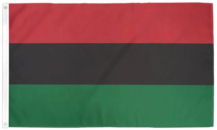
Pan-African
Adopted: August 13, 1920
Use: Ethnic Flag
Ratio: N/A
Designed By: Marcus Garvey
Design: A tricolor consisting of three equal horizontal bands of red, black, and green.
About: The Universal Negro Improvement Association and African Communities League (UNIA-ACL) formally adopted the Pan-African flag during a month-long convention held in New York City that resulted in the Declaration of the Rights of the Negro Peoples of the World.
The Univesal Negro Catechism, published by the UNIA, gave the colors the following meanings: red symbolizes the color of blood which men much shed for their redemption and liberty; black is the color of the noble and distinguished race to which [negroes] belong; green is the color of the luxuriant vegetation of the Motherland.
UNIA more recently modernized what the colors of the flag represent: red is the blood that unites all people of Black African ancestry, and shed for liberation; black is for black people whose existence as a nation. though not a nation-state, is affirmed by the existence of the flag; and green is the abundant natural wealth of Africa.
The flag later became a Black Nationalist symbol for the worldwide liberation of Black people and a symbol for Black pride, while becoming more popular during the B;ack Liberation movement of the 1960s.
-
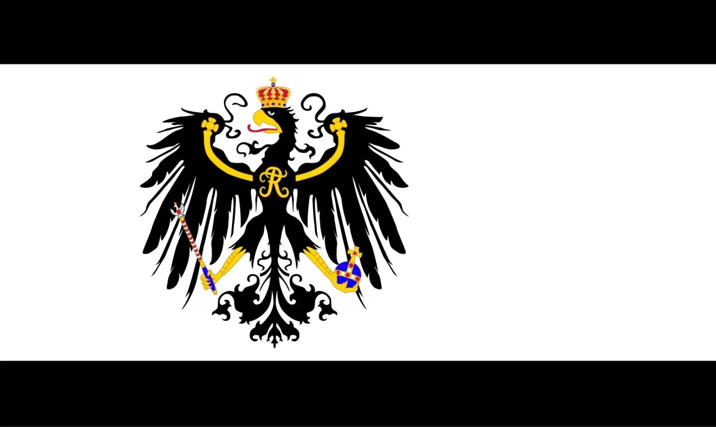
Prussia
Adopted: 1415
Use: National/Merchant/War Flag
Ratio: 3:5
Design: White field with black top and bottom borders, charged with an eagle holding a blue orb bound in gold and a scepter ending in another eagle.
History: The Prussian national and merchant flag was originally a simple black-white-black flag issued on May 22, 1818, but was later revised and replaced over time. The thickness of the black and the size and details of the eagle have changed over time.
The Prussian war flag, adopted November 28, 1816, was shallow-tailed for one-fifth of the total length; the tail was later abandoned. At two-fifths it showed the Prussian eagle (two-thirds of the flag's height). An Iron Cross was placed (one-third of the flag's height) in the canton.
-
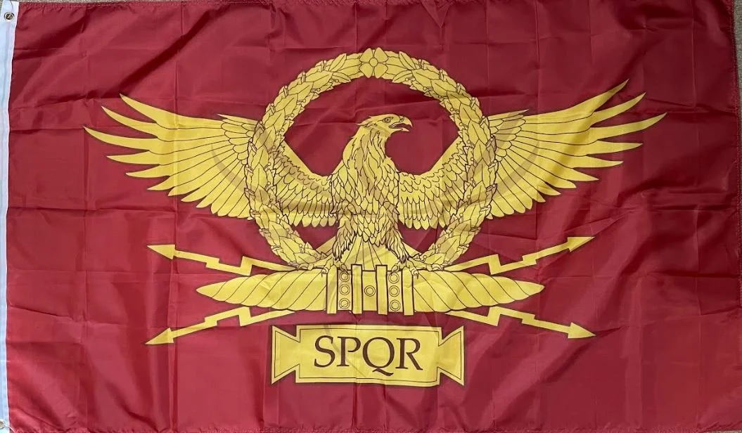
Roman Senate
Adopted: Roman Republic - 509 - 27 BC
Use: Civil Flag
History: SPQR, an abbreviation for Senatus Populusque Romanus in Latin, or "The Roman Senate and People" in English, is an emblematic abbreviated phrase referring to the government of the ancient Roman Republic. It appears on Roman currency, at the end of documents made public by an inscription in stone or metal, and in dedications of monuments and public and civil works.
-
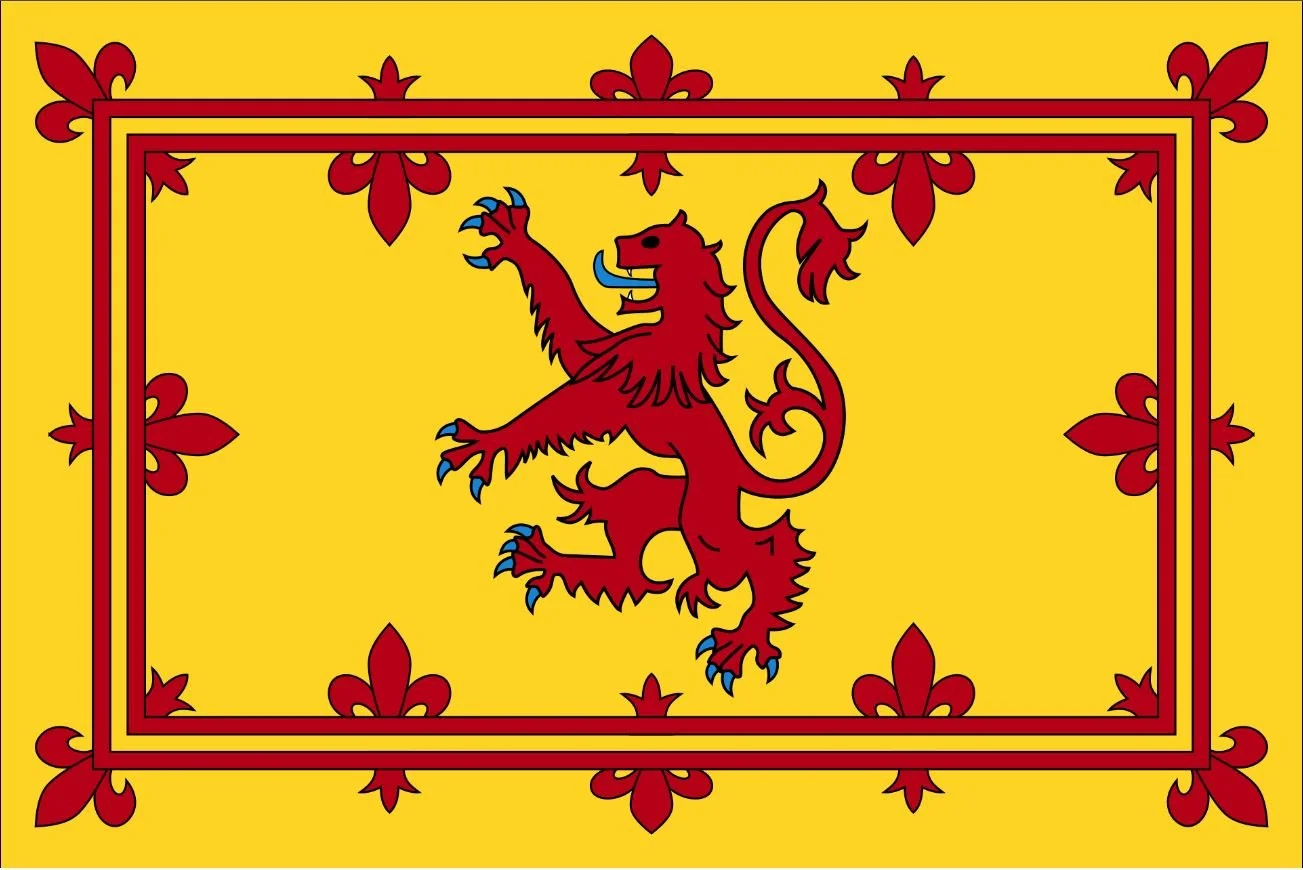
Royal Banner of Scotland
Adopted: 13th Century
Use: Scottish Monarchs
Ratio: House banner: 5:4 ratio
Mass Produced Renditions: 1:2 or 2:3
First Used By: Alexander II in 1222, with the double border set with lilies added by Alexander III (1249-1286)
Design: Red and black lion rampant with blue claws and tongue, within a red double border having a motif of alternating heraldic lilies on a yellow field
Symbolism: The Lion rampant has been used as a heraldic symbol by heirs of Malcolm III and the Lion rampant motif is used as a badge by those Irish clans that have lineage in common with Malcolm III.
The Lion Rampant royal emblem occupied the shield of the royal coat of arms of the ancient Kingdom of Scotland which, together with a royal banner displaying the same, was used by the King of Scots until the Union of the Crowns in 1603, when James VI ascended to the thrones of the kingdoms of England and Ireland.
Since 1603, the lion rampant of Scotland has been incorporated into both the royal arms and royal banners of successive Scottish then British monarchs in order to symbolize Scotland, as can be seen today in the Royal Standard of the United Kingdom.
Although now officially restricted to use by representatives of the Monarch and at royal residences, the Royal Banner continues to be one of Scotland’s most recognizable symbols.
-
Women's Suffragists Protest
Adopted: 1902
Use: Protest Flag
Designed By: Women's Suffrage Movement
Design: Thirteen horizontal stripes alternating red and white; in the canton, four white stars in the four corners on a blue field.
Symbolism: The Women's Suffrage Movement created their own version of the Stars and Stripes with only four stars, while there were 45 at the time, to symbolize the only four states that allowed women to vote at the time.
LGBTQIA+ Flags
-
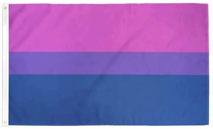
Bisexual
Adopted: 1998
Use: Pride Flag
Ratio: 3:5
Designed By: Michael Page
Design: Three solid horizontal bars: two fifths pink, one fifth purple, two fifths blue.
Symbolism: The pink stripe represents attraction to the same sex, while the blue represents attraction to the opposite sex. The purple stripe, the resulting "overlap" of the blue and pink stripes, represents the attraction to both sexes.
-
Drag Pride
Adopted: March 2015
Use: Pride Flag
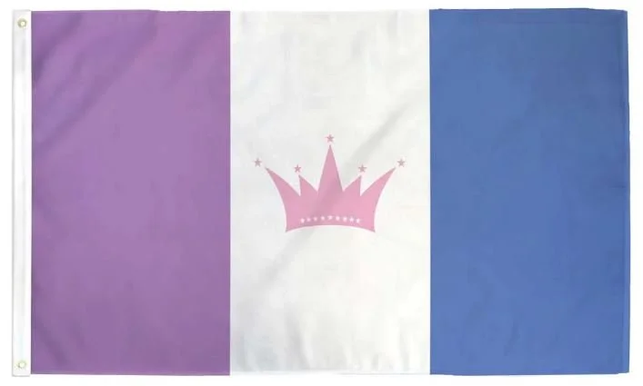
Designed By: Veranda
Design: A vertical triband of purple, white, and blue with a pink crown with stars at the tips and along the base of the crown.
Symbolism: From dragpride.com, "Purple represents the passion for drag we all share. White represents the blank slate that is our body and face that we all change to create the characters that we become. Blue represents self-expression and loyalty. The crown represents leadership in the community. The stars represent the many forms of drag.
-
Gender Fluid Pride
Adopted: 2012
Use: Pride Flag
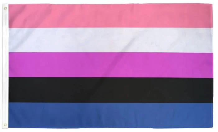
Designed By: JJ Poole
Design: Five horizontal stripes of five colors:pink, white, purple, black, and blue.
Symbolism: Pink stands for femininity, blue for masculinity, purple for both masculinity and femininity, black for the lack of gender, and white for all genders.
-
Intersex Progress Pride
Adopted: 2021
Use: Pride Flag
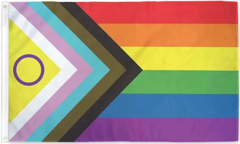
Designed By: Valentino Vecchietti of Intersex Equality Rights UK
Design: Six horizontal bands from top to bottom: red, orange, yellow, green, blue, and purple; with a chevron along the hoist from left to right: yellow, white, pink, light blue, brown, and black with a purple circle within the yellow chevron.
Symbolism: This flag was designed to celebrate diversity and inclusion for everyone in the LGBTQIA+ community. It combines elements of the traditional rainbow flag, other LGBTQIA+ flags to highlight groups that have been underrepresented in pride celebrations. The addition of the black and brown stripes to highlight the inclusion of LGBTQIA+ people of color.
-
Lesbian
Adopted: 2018
Use: Pride Flag
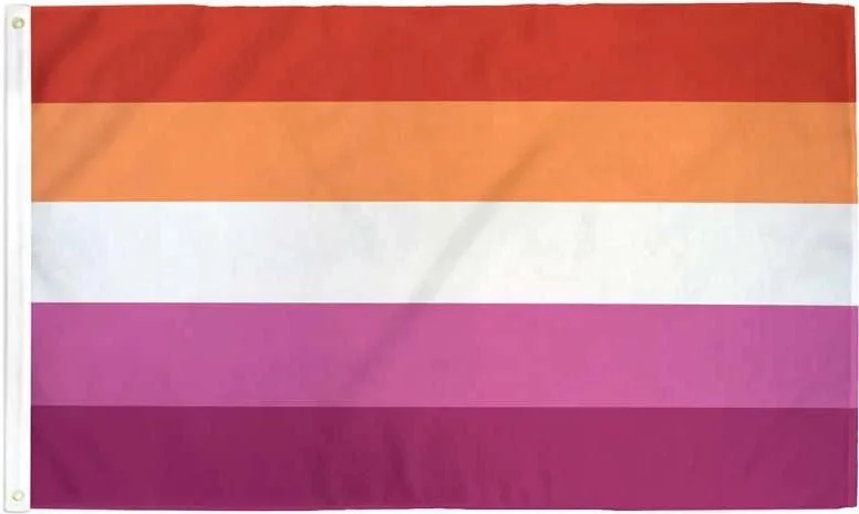
Designed By: Emily Gwen
Design: Five horizontal bands with colors from top to bottom: dark orange, orange, white, pink, and dark pink
Symbolism: The colors have the following symbolism:
Dark orange: gender non-conforming
Orange: Independence
White: Unique relationships to womanhood
Pink: Serenity and peace
Dark Pink: Femininity
-
LGBTQ+ Ally
Adopted: 2000s
Use: Allyship
Designed By: Unknown
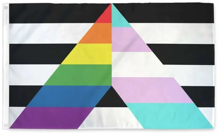
Design: Six horizontal bars alternating black and white with the letter A in the center with the left side of the letter with 6 equal horizontal bands: red, orange, yellow, green, blue, and purple; and the right side of the letter with 5 equal horizontal bands: blue, pink, white, pink, and blue.
Symbolism: The A stands for Ally with the rainbow symbolizing the LGBTQ+ Community and the black and white symbolizing heterosexual and/or cisgender people.
-
Non-Binary
Adopted: 2014
Use: Pride Flag
Ratio: 3:5
Designed by: Kye Rowan
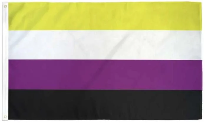
Design: Four solid horizontal bars: one sixth yellow, two sixths white, two sixths purple, and one sixth black.
Symbolism: The yellow stands for those whose gender do not exist within the binary, white and purple correspond to people identifying with all or many genders and those who may consider themselves to be a mix of female and male, and black accounts for those people who identify as not having any gender.
-
Pansexual
Adopted: 2010
Use: Pride Flag
Ratio: 3:5
Designed By: Jasper V.
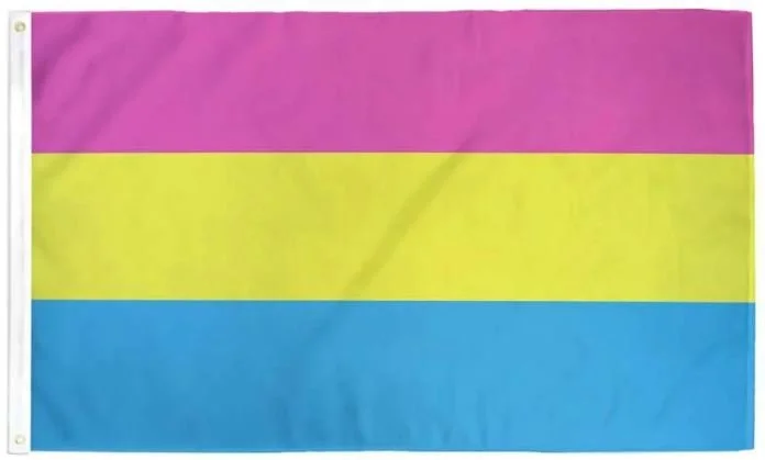
Design: Three equally sized solid horizontal bars: pink, yellow, and cyan.
Symbolism: The cyan represents attraction to men, pink represents attraction to women, and yellow represents non-binary people, such as those who are agender, bigender, and genderfluid.
History: The flag has been in wide use since the early 2010s when it was posted by an anonymous Tumblr account by its creator Jasper V. The flag functions as a symbol of the pansexual community, like the rainbow flag is used as a symbol for lesbian, gay, bisexual, transgender people and anyone else in the LGBT community. The pansexual pride flag is used to indicate that pansexuals have sexual attractions and relationships with people of different genders and sexualities. The theory of pansexuality aims to challenge existing prejudices, which can cause judgment, ostracism, and serious disorders within society.
-
Pink Triangle LGBT Pride
Adopted: 1980s
Use: Pride Flag
Designed By: LGBTQIA+ Community
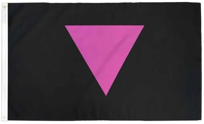
Design: Black field with a single pink triangle with the single point facing down.
Symbolism: The pink triangle has a long history of representing the LGBTQIA+ community. Beginning in the 1980s, the pink triangle became increasingly used as a positive symbol of both self and community identity. It is commonly used to represent both gay and lesbian identity, and was incorporated into the logos of such organizations and businesses.
History: Initially, the badge was intended as a badge of shame in Nazi Germany during the 1930s and 1940s, when it began as one of the Nazi concentration camp badges, used to distinguish those imprisoned because they were identified as gay men. Gay prisoners were given some of the worst tasks and were persecuted even by other prisoners.
In the 1980s, it was revived as a symbol of protest against homophobia, and has since been adopted by the larger LGBT community as a popular symbol of LBGT pride and the LGBT movements and queer liberation movements.
-
Progressive Pride
Adopted: 2018
Use: Pride Flag
Ratio: 3:5
Designed By: Daniel Quasar
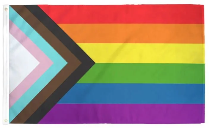
Design: Six horizontal bands from top to bottom: red, orange, yellow, green, blue, and purple; with a chevron along the hoist from left to right: white, pink, light blue, brown, and black.
Symbolism: The redesign incorporated elements from both the Philadelphia flag and trans pride flag to bring focus on inclusion and progress within the community. The flag design quickly spread as the Progress Pride Flag, prompting worldwide coverage in the news outlets. While retaining the common six-stripe rainbow flag as a base, the "Progress" variation adds a chevron along the hoist that features black, brown, light blue, pink, and white stripes to bring those communities (marginalize people of color, trans people, and those living with HIV/AIDS and those who have been lost) to the forefront; "the arrow points to the right to show forward movement, while being along the left edge shows that progress still needs to be made".
-
Queer Pride
Use: Pride Flag
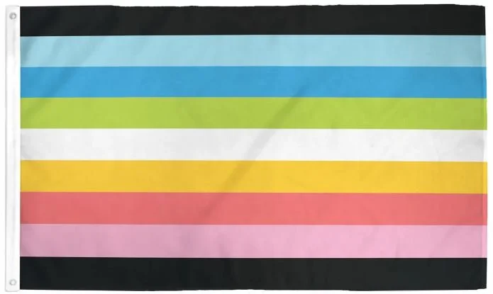
Design: Nine horizontal stripes from top to bottom: black, light blue, blue, green, white, orange, pink, light pink, and black.
Symbolism: The blue and pink stripes represent same-gender attraction. The orange and green stripes represent non-binary people. The black and white stripes represent asexual, aromantic, as well as agender people.
-
Transgender
Adopted: 1999
Use: Pride Flag
Ratio: 3:5
Designed By: Monica Helms
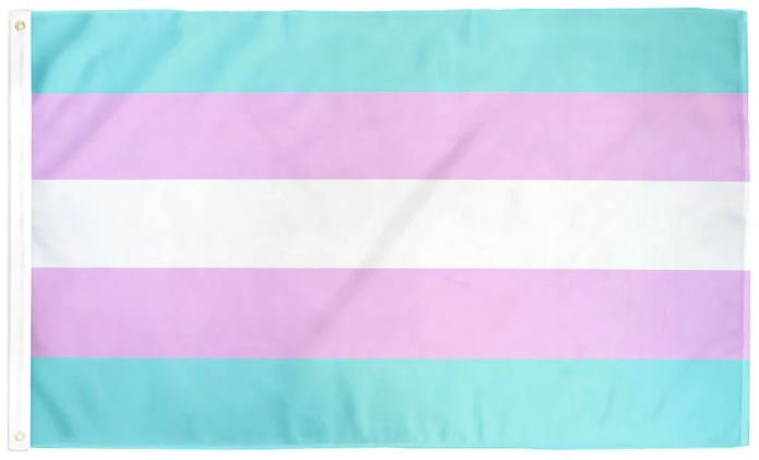
Design: Five horizontal stripes of three colors: light blue, light pink, and white.
Symbolism: The baby blue stripes are the traditional colors of a baby boy. Similarly, pink is the color for a baby girl. The white in the middle symbolizes those who are transitioning between the two genders and those who don't identify with either.
Organization Flags
-
European Union
Adopted: December 9, 1955
Use: Symbol of Europe, representing the European Union (27 members)
Ratio: 2:3
Designed By: Arsène Heitz and Paul M. G. Lévy
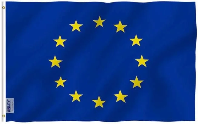
Design: A circle of twelve five-pointed yellow stars on a blue field.
Symbolism: Originally designed in 1955 for the Council of Europe (CoE), the flag was adopted by the European Communities, the predecessors of the present European Union (EU), in 1986. The CoE gave the flag the symbolic description in the following terms, though the official symbolic description adopted by the EU omits the reference to the “Western World”:
“Against the blue sky of the Western World, the star symbolise the peoples of Europe in a form of a circle, a sign of union. Their number is invariably twelve, the figure twelve being the symbol of perfection and entirety.”
Council of Europe, December 7-9, 1955.
-
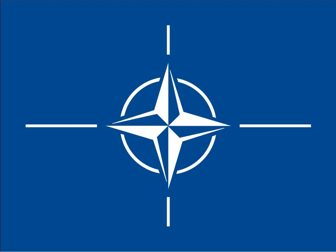
NATO
Adopted: October 14, 1953
Use: Organization
Ratio: 3:4
Designed By: North Atlantic Council
Design: A dark blue field charged with a white compass rose emblem from which radiate four white lines.
Symbolism: The colors of the flag carry cultural, political, and regional meanings. The dark blue field represents the Atlantic Ocean, while the circle stands for unity among the member states of NATO. The compass rose symbolizes the direction towards a path of peace, the goal that member states strive for.
The NATO flag was adopted nearly three years after the creation of the North Atlantic Treaty Organization, which was established on April 4, 1949.
-
Refugee Nation
Proposed: June 2015
Use: Proposed Nation
Designed By: Jason Busi
Design: Red-orange field with a black horizontal stripe in the bottom third.
Symbolism: The red-orange flag is meant to resemble the life vests of Mediterranean refugees.
Proposal: Refugee Nation is a proposal to create a new nation to voluntarily resettle the world's refugee population to solve the ongoing crisis. According to United Nations estimates, there were about 82 million refugees and internally displaced people in the world at the time of the proposal.
In the proposal, a number of alternatives for creating a nation of refugees, including:
Buying uninhabited islands from a country such as the Philippines or Indonesia.
A country with a lot of habitable but unused land giving away or selling this land for the purpose of establishing a refugee nation, such as Finland.
A small island nation which is sparsely populated agreeing to become a refugee nation. Current citizens would receive significant financial benefits.
New islands to be created in international waters as a homeland for refugees.
-
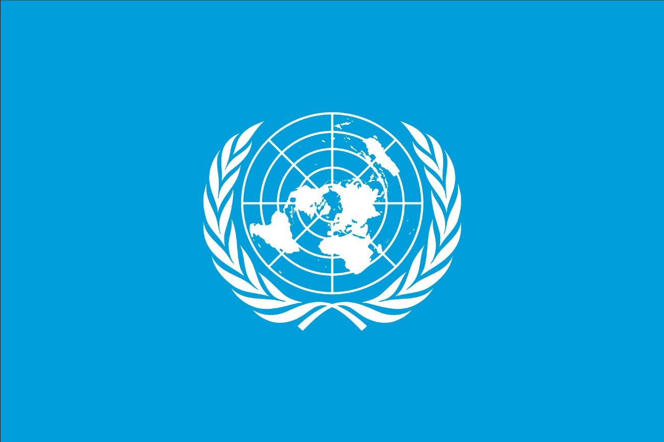
United Nations
Adopted: October 20, 1947
Use: Organization
Ratio: 2:3 or 3:5
Designed By: Donald McLaughlin (emblem only)
Design: A white UN emblem (a polar azimuthal equidistant projection world map surrounded by two olive branches) on a blue background.
Symbolism: The UN flag consists of the white emblem on the sky blue background. The emblem depicts a azimuthal equidistant projection of the world map, centered on the North Pole, with the globe being bisected in the center by the Prime meridian and the International Date Line, thus ensuring no country is at prominence within the flag. The projection of the map extends to 60 degrees south latitude, and includes five concentric circles.
The map is inscribed in a wreath consisting of crossed conventionalized branches of the olive tree.
The olive branches are a symbol for peace and the world map represents all the people and the countries in the world.
Other Flags
-
-
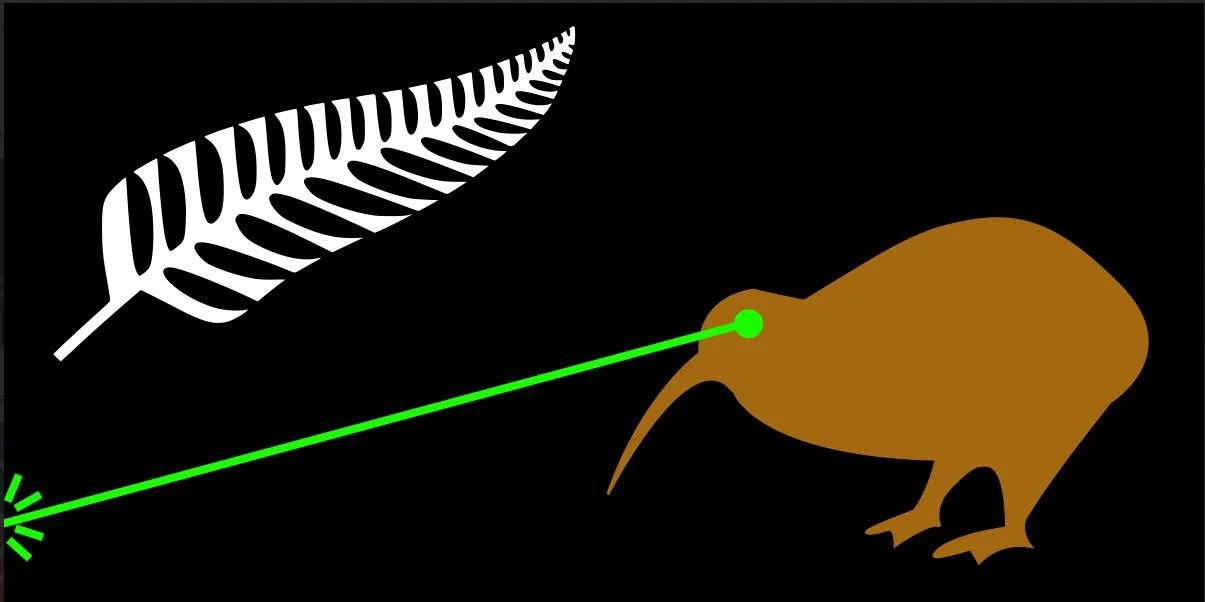
Laser Kiwi
Proposed: 2015
Use: Proposal
Designed By: Lucy Gray
Design: Black flag charged with a New Zealand fern and a kiwi shooting a green laser beam from its eye.
Symbolism: "The laser beam projects a powerful image of New Zealand. I believe my design is so powerful it does not need to be discussed."
Sports Flags
-
-
Boston Celtics - Bill Russell Edition
Use: Team Flag
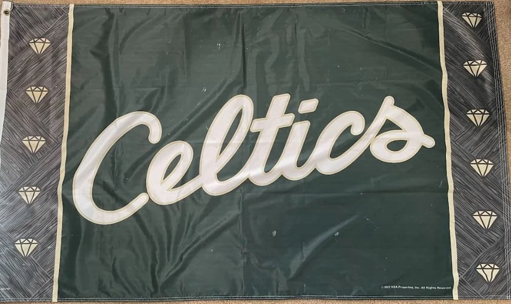
Design: Dark green field emblazoned with Celtics written in white cursive font, the hoist side has one-sixth vertical band with gray pattern and 5 diamonds while the fly side has one-sixth vertical band with the gray pattern and 6 diamonds.
Symbolism: This edition of the Celtics Flag commemorates the passing of Celtics Legend Bill Russell, who was an 11-time NBA champion as a player and coach.
-
WNBA
Adopted: 2019
Use: Sports League
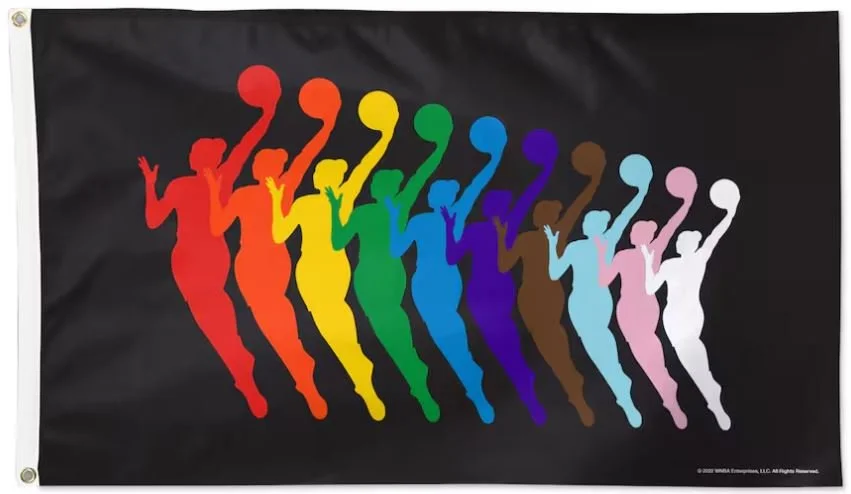
Design: A black field charged with ten silhouettes of the 2019 WNBA logo, decreasing in size from left to right in the following colors: red, orange, yellow, green, blue, purple, brown, light blue, pink, white.
Symbolism: It is believed to be a silhouette of the younger recently retired WNBA player, Sue Bird. Bird was drafted by the Seattle Storm in 2002, playing a total of 20 seasons and winning championships in 2004, 2010, 2018, and 2020.
